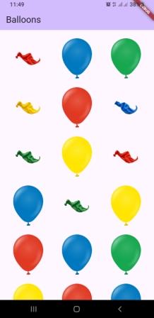
In this article, we learn an animation concept for a balloon burst animation. This may look like a simple animation, but the concept behind it is at an advanced level. By using this, you can create your own animations for celebrations, birthdays, and order-completed pages in shopping apps, etc.
The main purpose of this article is to provide the source code for this balloon burst animation so that you can use it in your own application.
Dart Files for the Balloon Burst Animation Widget
The source code includes the following files:
balloon.dart
balloon_item.dart
particle.dart
particle_controller.dart
particle_painter.dart
balloon_burst_widget.dart
How to Use the Balloon Burst Animation Widget in Your App
Copy all the files mentioned above from the source code and paste them into your own project. Then use the widget class “BalloonBurstWidget” from the balloon_burst_widget.dart file. After that, pass a list of your own images to this widget.
For testing purposes, you can also copy all the images from the source code assets folder.
Want more ready-to-use source code for your projects? Explore our Source Codes page, where you’ll find examples from various programming languages and frameworks that can help you bring your ideas to life.
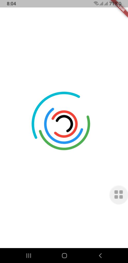
Loading indicators are an important part of making a mobile experience look and feel smooth and professional. A lot of developers use built-in progress bars or spinners, but custom animations can make your app look different, help with branding, and make it feel like it’s flowing.
This guide will show you how to use Jetpack Compose (for Android) and Flutter to make a more complex custom loading animation for mobile apps. The goal is to make a fun-to-watch multi-ring spinner animation that spins in different directions, at different speeds, and with arcs of different shapes. Your UI will look fresh and new with this.
⭐ Why It’s Important to Have a Custom Loading Animation
A good loading animation will give you
More interaction with users
Different looks for each brand
There are no issues when you switch screens.
It feels like a premium app.
People believe they don’t have to wait as long.
You can make complicated animated parts with very little code using Jetpack Compose and Flutter, two modern UI frameworks.
Jetpack Compose for Android lets you make your own loading animation.
Developers can make UI in a declarative way with Jetpack Compose and use powerful APIs to add animations. We want to make a spinner with a lot of rings that are stacked on top of each other and spin by themselves.
1. Model for Setting Up a Ring
First, we discuss the features of each animated ring:
Radius
Color
Stroke width
Opacity
Arc length
Direction of rotation
Rotation speed
These properties allow full customization for each ring in the spinner.
RingConfig Model
data class RingConfig(
    val id: String,
    val radius: Float,
    val color: Color,
    val strokeWidth: Float,
    val opacity: Float,
    val arcLength: Float,
    val direction: Int,     // +1 or -1
    val speed: Float        // seconds per rotation
)
2. Creating the Custom Loading Animation
For smooth animations that never end, Compose has rememberInfiniteTransition.
Each ring has its own float animation that shows how it turns:
Independent rotation for each ring
Control over speed and direction
Smooth, continuous animation
3. Drawing on a Canvas
There are dashed arcs and a rotating effect on the rings drawn on Canvas.
This setup allows:
Changeable radius
Stroke width that can be changed
Dividing arcs into parts
Each layer can move by itself.
These pieces work together to make a loading animation that looks great and works well with Android apps that are up to date.
Spinner Composable Function
@Composable
fun Loading(
    rings: List,
    size: Dp = 400.dp
) {
    //  All animations must be created here, NOT inside Canvas
    val transition = rememberInfiniteTransition()

    // Pre-calc animations for each ring
    val rotations = rings.map { ring ->
        transition.animateFloat(
            initialValue = 0f,
            targetValue = ring.direction * 360f,
            animationSpec = infiniteRepeatable(
                animation = tween(
                    durationMillis = (ring.speed * 1000).toInt(),
                    easing = LinearEasing
                ),
                repeatMode = RepeatMode.Restart
            )
        )
    }

    Box(
        modifier = Modifier.size(size),
    ) {
        Canvas(modifier = Modifier.fillMaxSize()) {

            val center = Offset(this.size.width / 2, this.size.height / 2)

            rings.forEachIndexed { index, ring ->
                val rotation = rotations[index].value

                val circumference = 2f * PI.toFloat() * ring.radius
                val dashArray = circumference * ring.arcLength
                val dashGap = circumference - dashArray

                rotate(rotation, pivot = center) {
                    drawCircle(
                        color = ring.color.copy(alpha = ring.opacity),
                        radius = ring.radius,
                        center = center,
                        style = Stroke(
                            width = ring.strokeWidth,
                            cap = StrokeCap.Round,
                            pathEffect = PathEffect.dashPathEffect(
                                floatArrayOf(dashArray, dashGap),
                                phase = 0f
                            )
                        )
                    )
                }
            }
        }
    }
}
How to use this Loading Composable Function
MainActivity.kt
class MainActivity : ComponentActivity() {
    override fun onCreate(savedInstanceState: Bundle?) {
        super.onCreate(savedInstanceState)
        enableEdgeToEdge()
        setContent {
            LoaderTheme {
                CustomSpinLoading()
            }
        }
    }
}

@Composable
fun CustomSpinLoading() {
    val rings = listOf(
        RingConfig(
            id = "a",
            radius = 50f,
            color = Color.Black,
            strokeWidth = 14f,
            opacity = 1f,
            arcLength = 0.6f,
            direction = -1,
            speed = 6f
        ),
        RingConfig(
            id = "b",
            radius = 80f,
            color = Color.Red,
            strokeWidth = 14f,
            opacity = 1f,
            arcLength = 0.8f,
            direction = 1,
            speed = 8f
        ),
        RingConfig(
            id = "c",
            radius = 120f,
            color = Color.Blue,
            strokeWidth = 14f,
            opacity = 0.9f,
            arcLength = 0.6f,
            direction = -1,
            speed = 9f
        ),
        RingConfig(
            id = "d",
            radius = 160f,
            color = Color.Green,
            strokeWidth = 14f,
            opacity = 0.8f,
            arcLength = 0.5f,
            direction = 1,
            speed = 9f
        ),

        RingConfig(
            id = "e",
            radius = 200f,
            color = Color.Cyan,
            strokeWidth = 14f,
            opacity = 0.8f,
            arcLength = 0.4f,
            direction = -1,
            speed = 8f
        )
    )

    Loading(rings = rings, size = 400.dp)
}
🟩 Flutter Loading Animation That You Can Change
Flutter has its own animation system that is based on controllers and custom painters, but it works in a similar way to declarative programming.
Check out the code below:
RingConfig.dart Model Class
class RingConfig {
final String id;
final double radius;
final Color color;
final double strokeWidth;
final double opacity;
final double arcLength;
final int direction; // +1 or -1
final double speed; // seconds per rotation

RingConfig({
required this.id,
required this.radius,
required this.color,
required this.strokeWidth,
required this.opacity,
required this.arcLength,
required this.direction,
required this.speed,
});
}
Drawing with CustomPainter
import 'dart:math';
import 'package:flutter/cupertino.dart';
import 'RingConfig.dart';

class LoadingPainter extends CustomPainter {
final List<RingConfig> rings;
final List<Animation<double>> rotations;

LoadingPainter(this.rings, this.rotations);

@override
void paint(Canvas canvas, Size size) {
final center = Offset(size.width / 2, size.height / 2);

for (int i = 0; i < rings.length; i++) {
final ring = rings[i];
final rotation = rotations[i].value;

final paint = Paint()
..color = ring.color.withValues()
..style = PaintingStyle.stroke
..strokeWidth = ring.strokeWidth
..strokeCap = StrokeCap.round;

final circumference = 2 * pi * ring.radius;
final dashLength = circumference * ring.arcLength;
final dashGap = circumference - dashLength;

final circlePath = Path()
..addOval(Rect.fromCircle(center: center, radius: ring.radius));

final dashedPath = _dashPath(circlePath, dashLength, dashGap);

canvas.save();
canvas.translate(center.dx, center.dy);
canvas.rotate(rotation * pi / 180);
canvas.translate(-center.dx, -center.dy);

canvas.drawPath(dashedPath, paint);

canvas.restore();
}
}

@override
bool shouldRepaint(covariant CustomPainter oldDelegate) => true;
}

Path _dashPath(Path source, double dashLength, double dashGap) {
final Path dest = Path();
double distance = 0.0;

for (final metric in source.computeMetrics()) {
while (distance < metric.length) {
final next = distance + dashLength;
dest.addPath(metric.extractPath(distance, next), Offset.zero);
distance = next + dashGap;
}
distance = 0.0;
}
return dest;
}
You can make a loading animation just for mobile apps (Jetpack Compose and Flutter), and it can be very rewarding. Both frameworks give developers everything they need to make motion graphics that are expressive without having to use animated assets or libraries from other companies.
This multi-ring spinner is a great example of:
Design of animations that can be changed
Framework-level APIs for drawing
Animation loops that go on forever and work well
Consistency between platforms
A well-designed loader can make your user interface a lot better, whether you’re making apps just for Android or for more than one platform.
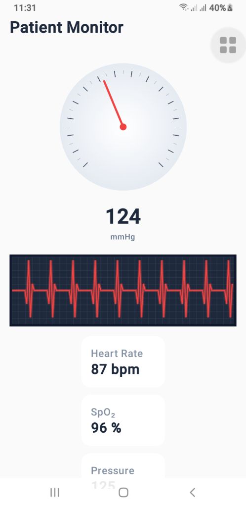
Modern health applications—whether you’re building a blood pressure app Android, an ECG app Android, or a heart rate monitor Android—require interfaces that are clean, smooth, and capable of updating in real time. With Jetpack Compose, Android developers can design advanced animated dashboards using only a few composable functions.
In this guide, we’ll walk through a complete real-time vital monitoring UI built entirely with Canvas, animations, and Jetpack Compose.
The final setup includes:
A pressure gauge (mmHg) for blood pressure visualization
A real-time ECG waveform renderer
A vital simulator that generates dynamic heartbeat, SpO₂, and pressure values
If you’re creating a health monitoring interface, these components provide a great foundation.
1. The Blood Pressure Gauge’s (PressureGauge) user interface
The PressureGauge composable makes a round gauge that is fully animated and looks like the dials on professional sphygmomanometers used in clinics.
Important parts of the gauge
The needle moves smoothly.
It ticks every 10 mmHg.
Major ticks every 20 mmHg.
A soft radial gradient background.
A 270° sweep (–135° to +135°), just like a medical pressure meter.
The needle moves smoothly toward the new pressure value when you use animateFloatAsState(). This makes it feel like a real machine, which is great for the UI of an Android blood pressure app.
PressureGauge Code
@Composable
fun PressureGauge(
    pressure: Float,
    maxPressure: Float = 300f,
    modifier: Modifier = Modifier
) {
    val animatedPressure by animateFloatAsState(
        targetValue = pressure,
        animationSpec = tween(800, easing = LinearOutSlowInEasing)
    )

    val size = 260.dp
    val center = size / 2

    Box(
        modifier = modifier
            .size(size)
            .padding(12.dp),
        contentAlignment = Alignment.Center
    ) {
        Canvas(modifier = Modifier.fillMaxSize()) {

            val w = this.size.width
            val h = this.size.height
            val cx = w / 2
            val cy = h / 2

            val rotation = -135f + (animatedPressure.coerceAtMost(maxPressure) / maxPressure) * 270f

            // BACKGROUND GRADIENT
            drawCircle(
                brush = Brush.radialGradient(
                    colors = listOf(Color.White, Color(0xFFE2E8F0))
                ),
                radius = w * 0.45f,
                center = Offset(cx, cy)
            )

            // TICKS
            for (i in 0..maxPressure.toInt() step 10) {
                val angle = -135f + (i / maxPressure) * 270f
                val rad = Math.toRadians((angle - 90).toDouble())

                val major = i % 20 == 0
                val length = if (major) 18f else 10f
                val width = if (major) 2f else 1f

                val rOuter = w * 0.4f
                val rInner = rOuter - length

                val x1 = cx + rOuter * cos(rad).toFloat()
                val y1 = cy + rOuter * sin(rad).toFloat()
                val x2 = cx + rInner * cos(rad).toFloat()
                val y2 = cy + rInner * sin(rad).toFloat()

                drawLine(
                    color = if (major) Color(0xFF334155) else Color(0xFF94A3B8),
                    start = Offset(x1, y1), end = Offset(x2, y2),
                    strokeWidth = width
                )
            }

            // NEEDLE
            rotate(rotation, pivot = Offset(cx, cy)) {
                drawLine(
                    start = Offset(cx, cy),
                    end = Offset(cx, cy - w * 0.35f),
                    color = Color(0xFFEF4444),
                    strokeWidth = 6f,
                    cap = StrokeCap.Round
                )
                drawCircle(
                    color = Color(0xFFEF4444),
                    center = Offset(cx, cy),
                    radius = 10f
                )
            }
        }
    }

    Column(horizontalAlignment = Alignment.CenterHorizontally) {
        Text(
            text = animatedPressure.toInt().toString(),
            fontSize = 34.sp,
            fontWeight = FontWeight.Bold,
            color = Color(0xFF1E293B)
        )
        Text(
            text = "mmHg",
            color = Color(0xFF64748B),
            fontSize = 12.sp
        )
    }
}
2. PulseECG – A real-time renderer for ECG waveforms
The waveform is the most important visual part of an ECG app for Android. The PulseECG composable makes it look like an ECG trace is moving by constantly moving a list of points. How it works
Keeps a list of 120 points that keeps changing
Changes values based on two conditions:
active: ECG is working
beating: heartbeats
Makes a dark grid that looks like a medical one
Draws a glowing red ECG path to make it look real
It looks a lot like real ECG monitor output and can easily take real medical data.
PulseECG Code
@Composable
fun PulseECG(
    active: Boolean,
    beating: Boolean,
    modifier: Modifier = Modifier
) {
    var points by remember { mutableStateOf(List(120) { 50f }) }
    var tick by remember { mutableStateOf(0) }

    LaunchedEffect(active, beating) {
        while (true) {
            delay(40)

            val new = points.toMutableList()
            new.removeAt(0)

            val updated = when {
                !active -> 50f
                !beating -> 50f + (Math.random().toFloat() - 0.5f) * 8f
                else -> when (tick % 12) {
                    0 -> 50f
                    1 -> 30f
                    2 -> 95f
                    3 -> 10f
                    4 -> 60f
                    else -> 50f
                }
            }
            new.add(updated)
            points = new

            if (beating) tick++
        }
    }

    Canvas(
        modifier = modifier
            .fillMaxWidth()
            .height(110.dp)
            .background(Color(0xFF0F172A))
            .padding(4.dp)
    ) {
        val w = size.width
        val h = size.height

        // GRID
        drawRect(Color(0xFF1E293B))
        for (x in 0 until w.toInt() step 20)
            drawLine(Color(0xFF334155), Offset(x.toFloat(), 0f), Offset(x.toFloat(), h))
        for (y in 0 until h.toInt() step 20)
            drawLine(Color(0xFF334155), Offset(0f, y.toFloat()), Offset(w, y.toFloat()))

        // ECG line
        val path = Path()
        points.forEachIndexed { i, v ->
            val x = (i / points.size.toFloat()) * w
            val y = h - (v / 100f) * h
            if (i == 0) path.moveTo(x, y) else path.lineTo(x, y)
        }

        // Glow
        drawPath(
            path = path,
            color = Color(0xFFEF4444).copy(alpha = 0.4f),
            style = Stroke(width = 8f)
        )

        drawPath(
            path = path,
            color = Color(0xFFEF4444),
            style = Stroke(width = 3f)
        )

    }
}
3. VitalSimulator – Generating Real-Time Readings
For demo purposes—or previewing UI—you can use VitalSimulator, a small composable that generates random:
Blood pressure
Heart rate (BPM)
SpO₂ oxygen level
This is especially useful while building a heart rate monitor Android interface.
VitalSimulator Code
@Composable
fun VitalSimulator(): Triple<Float, Float, Float> {
    var pressure by remember { mutableStateOf(120f) }
    var bpm by remember { mutableStateOf(75f) }
    var spo2 by remember { mutableStateOf(97f) }

    LaunchedEffect(Unit) {
        while (true) {
            delay(1500)
            pressure = (110..135).random().toFloat()
            bpm = (72..90).random().toFloat()
            spo2 = (96..99).random().toFloat()
        }
    }

    return Triple(pressure, bpm, spo2)
}
Putting It All Together
By combining these composables, you can build a polished dashboard showing:
Animated blood pressure
Real-time ECG waveform
BPM and SpO₂ levels
This is an excellent base for medical-style dashboards or consumer wellness applications.
Jetpack Compose makes it possible to build real-time health monitoring dashboards with only a few clean, efficient composables. Whether you’re working on a blood pressure app Android, an ECG app Android, or a heart rate monitor Android, these components give you a professional, animated, and scalable UI foundation.
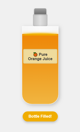
Animations make websites more engaging, and small micro-interactions can add a big impact to the user experience. One fun example is a Bottle Juice Fill Animation — a smooth effect that visually fills a bottle with juice using only HTML, CSS, and JavaScript.
✨ Why This Animation Stands Out
Lightweight: No frameworks or libraries required.
Interactive: The fill level can be adjusted dynamically with JavaScript.
Eye-catching: A perfect micro-animation for portfolios, landing pages, or product sites.
Modern: Works in all major browsers.
💻 How It Works
HTML provides the bottle structure.
CSS creates the bottle shape and smooth filling effect.
JavaScript controls the fill percentage and triggers the animation.
This combination results in a physics-inspired, satisfying animation that looks great in modern UI design.
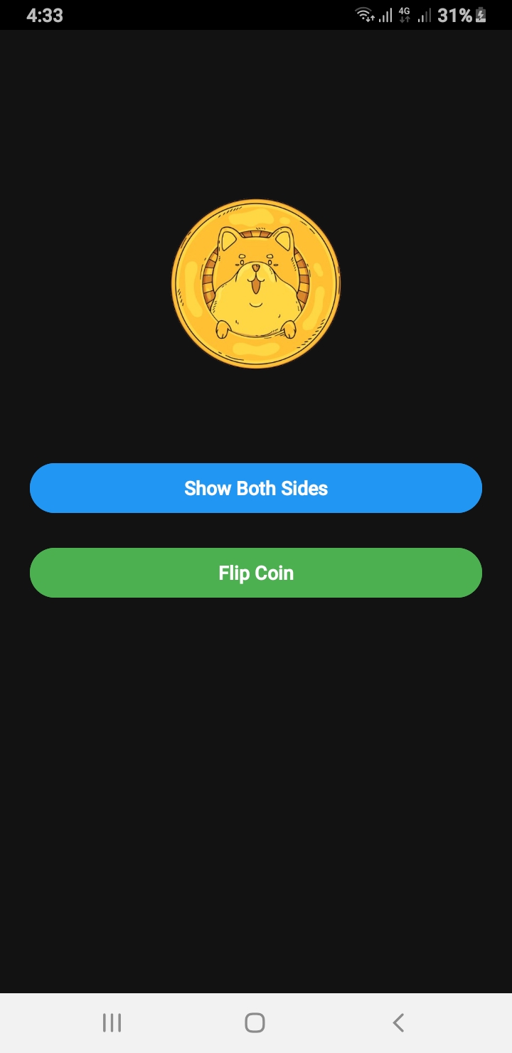
If you are searching for a Flip Coin Source Code Android example, this guide will walk you through building a realistic coin flip animation in Android using Java. This example includes sound effects, both sides of the coin visible during flipping, and a clean user interface built with ConstraintLayout.
Why Use This Flip Coin Source Code Android Example?
This project is perfect for beginners and intermediate developers who want to learn about animations, MediaPlayer usage, and responsive layouts. Whether you are creating a decision-making app, a fun game, or just experimenting with Android animations, this Flip Coin Source Code Android will save you time and effort.
Flip Coin Source Code Android – MainActivity.java
public class MainActivity extends AppCompatActivity {

    ImageView coinImage;
    Button btnShowSides, btnFlip;
    int side = 0;

    @Override
    protected void onCreate(Bundle savedInstanceState) {
        super.onCreate(savedInstanceState);
        setContentView(R.layout.activity_main);
        ViewCompat.setOnApplyWindowInsetsListener(findViewById(R.id.main), (v, insets) -> {
            Insets systemBars = insets.getInsets(Type.systemBars());
            v.setPadding(systemBars.left, systemBars.top, systemBars.right, systemBars.bottom);
            return insets;
        });
        // Set status bar color to black
        getWindow().setStatusBarColor(ContextCompat.getColor(this, R.color.black));

        coinImage = findViewById(R.id.coinImage);
        btnShowSides = findViewById(R.id.btnShowSides);
        btnFlip = findViewById(R.id.btnFlip);
        coinImage.setImageResource(R.drawable.head); //  Set initial image
        btnFlip.setEnabled(true);

        btnShowSides.setOnClickListener(view -> {
            showBothSidesInstant();

        });

        btnFlip.setOnClickListener(view -> flipCoinRealistically());
    }


    private void showBothSidesInstant() {
        if (side == 0) {
            coinImage.setImageResource(R.drawable.tail);
            side = 1;
        } else {
            coinImage.setImageResource(R.drawable.head);
            side = 0;
        }
    }

    private void flipCoinRealistically() {
        boolean isHeads = new Random().nextBoolean();

        // Optional: play coin flip sound
        MediaPlayer mp = MediaPlayer.create(this, R.raw.coin_sound);
        mp.start();
        mp.setOnCompletionListener(MediaPlayer::release);

        // Track which side is showing
        final boolean[] showingHeads = {true};

        // Listener to change image mid-flip
        ValueAnimator flipAnimator = ValueAnimator.ofFloat(0f, 1f);
        flipAnimator.setDuration(5000); // total time
        flipAnimator.setInterpolator(new LinearInterpolator());
        flipAnimator.addUpdateListener(animation -> {
            float progress = (float) animation.getAnimatedValue();
            float totalRotation = progress * 4320f; // 12 full flips (10 fast + 2 slow)
            coinImage.setRotationX(totalRotation);

            // At every 180°, swap image
            if ((int) (totalRotation / 180) % 2 == 0 && !showingHeads[0]) {
                coinImage.setImageResource(R.drawable.head);
                showingHeads[0] = true;
            } else if ((int) (totalRotation / 180) % 2 != 0 && showingHeads[0]) {
                coinImage.setImageResource(R.drawable.tail);
                showingHeads[0] = false;
            }
        });

        // When done, show final result
        flipAnimator.addListener(new AnimatorListenerAdapter() {
            @Override
            public void onAnimationEnd(Animator animation) {
                coinImage.setRotationX(0f);
                coinImage.setImageResource(isHeads ? R.drawable.head : R.drawable.tail);
            }
        });

        flipAnimator.start();
    }

}
Flip Coin Source Code Android – XML Layout (activity_main.xml)
Looking to build a fun and engaging spin-the-wheel app for giveaways, lucky draws, games, or random selections? This post covers a complete mini wheel spinner app built with:
✅ Android Java using Custom Views
✅ Android Jetpack Compose
✅ Cross-platform Flutter (Android, iOS, and Web)
It’s lightweight, beautifully animated, and perfect for learners and developers. Whether you’re creating a decision-maker app or adding gamification to your product — this is your go-to solution.
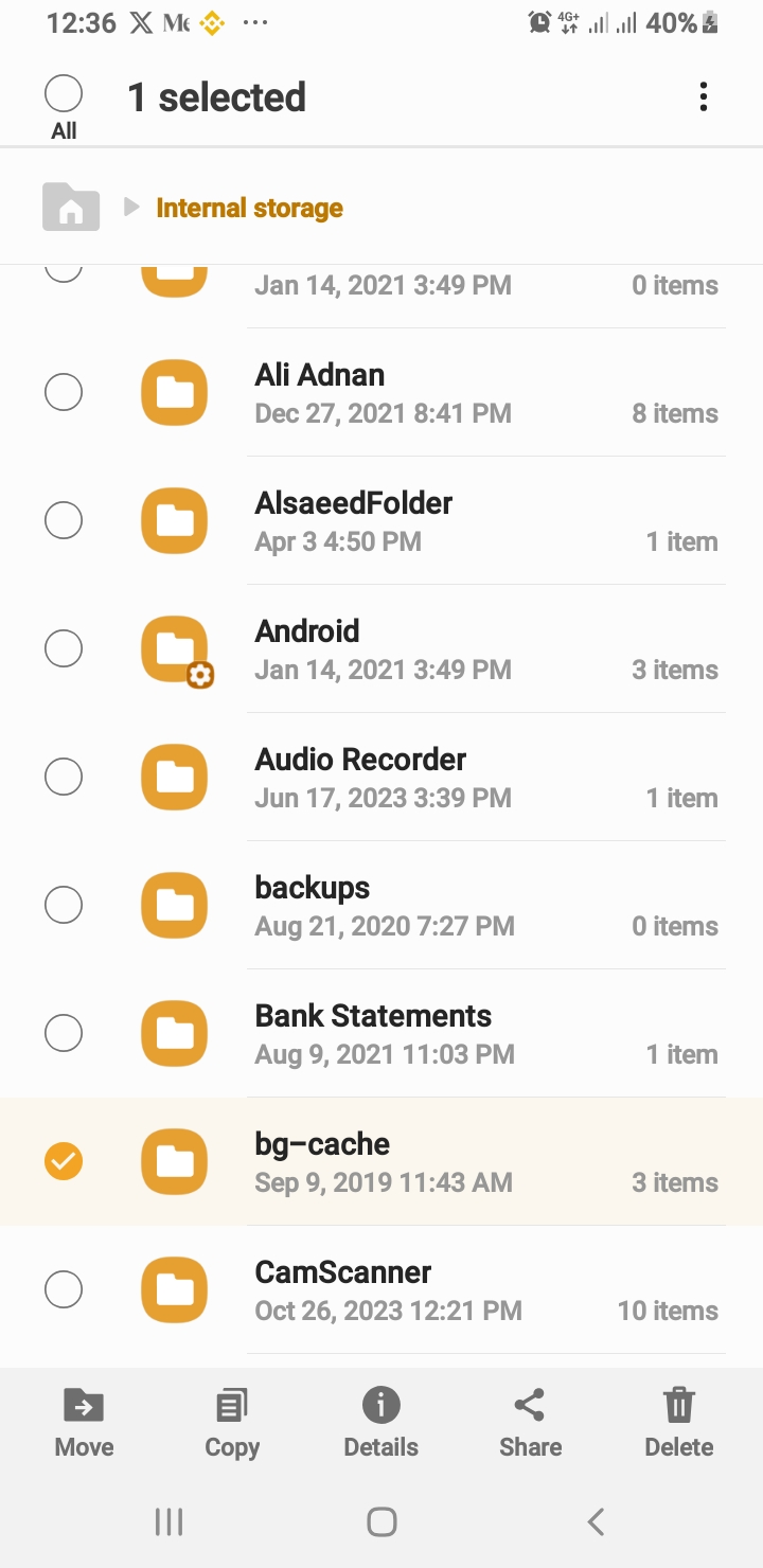
Looking for a production-ready Android file manager app source code written in Java? Look no further! File Manager Pro is a clean, fully functional, open-source file explorer built using modern development practices. It’s perfect for developers who want to learn, customize, or extend a real-world Android file manager project.
🚀 Key Features
✅ Browse files and folders with a responsive UI
✅ Toggle show/hide hidden files support
✅ Multi-select with bottom menu actions: Copy, Move, Delete
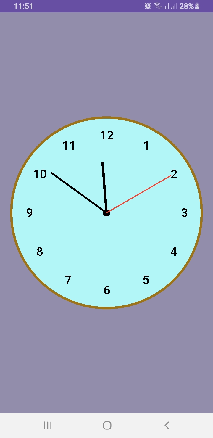
Want to design a custom analog clock in Android? In this post, you’ll learn how to create one using both Java and Kotlin. Whether you’re building a utility app, dashboard UI, or simply improving your UI skills, this is the perfect project to implement a working analog clock in Android.
🎯 What’s Inside This Project?
You’ll get the complete source code for both languages, canvas-based drawing, second-by-second ticking hands, and a beautiful rounded design. Let’s dive into development!
✅ What You’ll Learn
How to draw a custom analog clock using Canvas
Java and Kotlin implementations side by side
Center dot, circular frame, and dynamic ticking hands
Modern, responsive UI layout for all screen sizes
This article provides two versions: AnalogClockView.java and AnalogClockViewKotlin.kt. You can use either based on your language preference.
📄 XML Layout
To use the custom clock in your activity, add this to your activity_main.xml:
Creating a custom analog clock in Android is a great way to explore Canvas drawing, custom views, and elegant UI development. Whether you choose Java or Kotlin, the outcome is a clean and dynamic clock component ready for your next project.
We used the Paint class extensively to draw shapes and text on the canvas. To learn more about its capabilities, see the official documentation here:
🔗 Android Developers
Don’t forget to share and follow Al Saeed for more hands-on Android tutorials.
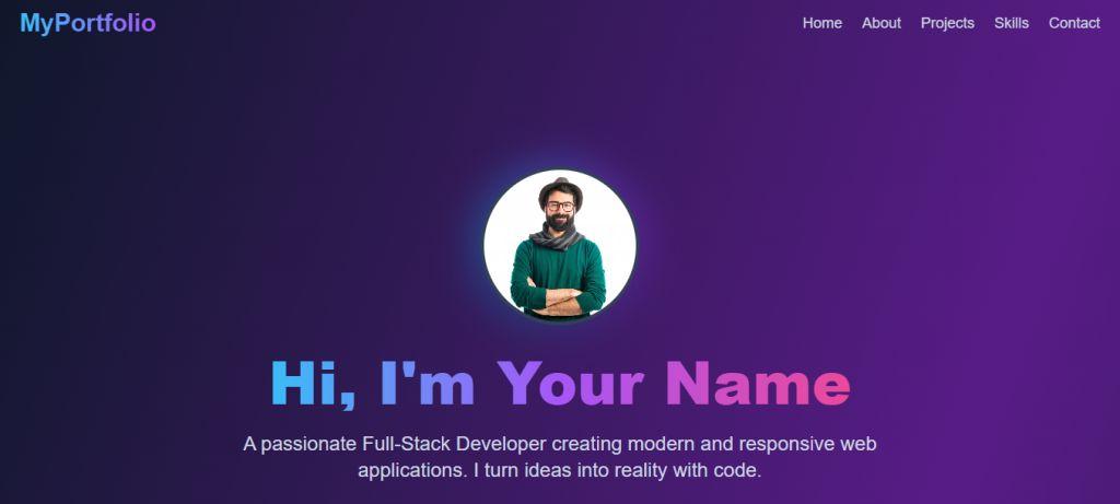
Are you a developer, designer, freelancer, or student looking to create a standout personal portfolio website without starting from scratch? This Free React Portfolio Website Template, generated using the latest AI technologies, helps you launch your professional online presence effortlessly.
Whether you’re showcasing your skills, side projects, or freelance services, this template gives you a modern, responsive, and SEO-friendly starting point — built with React + Vite for lightning-fast performance.
🎯 Why Use This Free React Portfolio Website Template?
Here are the top reasons why this React portfolio template stands out:
✅ Modern & Clean UI Design – Built with a sleek layout to attract and engage visitors ✅ Powered by React & Vite – Ensures optimal build speed and performance ✅ Responsive Design – Looks stunning on mobile, tablet, and desktop ✅ Highly Customizable – Edit styles, sections, and content with ease ✅ SEO Optimized – Fast load times, semantic HTML, and clean codebase ✅ Open-Source & Free – Use it freely for your personal or professional portfolio
This Free React Portfolio Website Template is your shortcut to building a beautiful and professional portfolio in no time.
🔧 Technologies Used
React.js – Component-based frontend library
Vite – Next-generation frontend tooling
CSS Modules / Tailwind CSS (optional depending on customization)
Free Source Code
Click the button below to download the complete source code:
If you’re looking to create a simple media player in Android Studio using Kotlin, this article will guide you through the core of your project: the MainActivity. This is where permissions are handled, songs are loaded from device storage, and user interactions are managed.
Overview of Media Player MainActivity
The MainActivity is responsible for:
Checking and requesting runtime permissions
Fetching music files from the device storage
Binding to the MusicService for background playback
Handling user interactions like play, pause, next, and previous
Kotlin Code Breakdown for Media Player
The class implements AppCompatActivity and ServiceConnection to establish communication with the background music service. It uses ActivityMainBinding for UI binding and coroutines to prevent blocking the main thread while querying songs from MediaStore.
Permission Handling for Media Player
For Android 13+ (Tiramisu), it requests READ_MEDIA_AUDIO. For earlier versions, READ_EXTERNAL_STORAGE is used.
Loading Songs
The app queries MediaStore.Audio.Media using a coroutine and populates the songsList if the files exist.
Binding Media Player to MusicService
On successful service connection, the list is passed to the service and the UI is updated with the currently playing song title.
Media Player Controls and Playback
The play/pause, next, and previous buttons update the state using MusicService. The UI is automatically refreshed using updateControls().
Other Media Player App Classes
To complete the media player, create the following Kotlin classes and paste their code accordingly:
MusicService.kt – Manages playback in the background
AudioModel.kt – Data class representing a song
MusicAdapter.kt – Binds song data to RecyclerView
MusicPlayerActivity.kt – Full screen music controls
1. MainActivity.kt
  class MainActivity : AppCompatActivity(), ServiceConnection {
    private var musicService: MusicService? = null
    private var isServiceBound = false
    private lateinit var binding: ActivityMainBinding
    private val songsList: MutableList = mutableListOf()
    private lateinit var adapter: MusicAdapter
    private var isPlaying = false

    override fun onCreate(savedInstanceState: Bundle?) {
        super.onCreate(savedInstanceState)
        binding = ActivityMainBinding.inflate(layoutInflater)
        setContentView(binding.root)
        window.statusBarColor = Color.WHITE

        if (!checkPermission()) {
            requestPermission()

        } else {
            initializeApp()
        }

    }


    private fun initializeApp() {
        // Launch coroutine on Main thread
        CoroutineScope(Dispatchers.Main).launch {

            // Show progress bar
            binding.progressBar.visibility = View.VISIBLE

            val songs = withContext(Dispatchers.IO) {
                val songs = ArrayList()
                val projection = arrayOf(
                    MediaStore.Audio.Media.TITLE,
                    MediaStore.Audio.Media.DATA,
                    MediaStore.Audio.Media.DURATION
                )
                val selection = MediaStore.Audio.Media.IS_MUSIC + " !=0"

                contentResolver.query(
                    MediaStore.Audio.Media.EXTERNAL_CONTENT_URI,
                    projection,
                    selection,
                    null,
                    null
                )?.use { cursor ->
                    while (cursor.moveToNext()) {
                        val audioModel = AudioModel(
                            cursor.getString(1),
                            cursor.getString(0),
                            cursor.getString(2)
                        )
                        if (File(audioModel.path).exists()) {
                            songs.add(audioModel)
                        }
                    }
                }
                songs
            }

            // Hide progress bar
            binding.progressBar.visibility = View.GONE

            songsList.clear()
            songsList.addAll(songs)

            adapter = MusicAdapter(this@MainActivity, songsList) { position ->
                if (isPlaying) {
                    musicService?.musicPlay(songsList)
                    binding.songTitle.text = songsList[MyMediaPlayer.currentIndex].title
                    adapter.notifyDataSetChanged()
                } else {

                    if (songsList.isNotEmpty()) {
                        val intent = Intent(this@MainActivity, MusicPlayerActivity::class.java)
                        intent.putExtra("List", songsList as Serializable)
                        intent.flags = Intent.FLAG_ACTIVITY_NEW_TASK
                        startActivity(intent)
                    } else {
                        Toast.makeText(this@MainActivity, "No songs to play", Toast.LENGTH_SHORT)
                            .show()
                    }

                }
            }

            binding.recyclerView.layoutManager = LinearLayoutManager(this@MainActivity)
            binding.recyclerView.adapter = adapter
            binding.noSongFound.visibility = if (songsList.isEmpty()) View.VISIBLE else View.GONE

            setupControls()
        }
    }


    private fun setupControls() {
        val intent = Intent(this, MusicService::class.java)
        bindService(intent, this, Context.BIND_AUTO_CREATE)

        binding.pausePlay.setOnClickListener {
            musicService?.getMusicPlayer()?.let {
                if (it.isPlaying) {
                    it.pause()
                    binding.pausePlay.setImageResource(R.drawable.play_ic)
                } else {
                    it.start()
                    binding.pausePlay.setImageResource(R.drawable.pause_ic)
                }
            }
        }


        binding.next.setOnClickListener { musicNext() }
        binding.previous.setOnClickListener { musicPrevious() }

        binding.controls.setOnClickListener {
            val intent1 = Intent(this@MainActivity, MusicPlayerActivity::class.java)
            intent1.putExtra("IS", true)
            intent1.putExtra("List", songsList as Serializable)
            startActivity(intent1)
        }
    }


    private fun musicNext() {

        musicService?.next()
        binding.songTitle.text = songsList[MyMediaPlayer.currentIndex].title
        adapter.notifyDataSetChanged()

    }


    private fun musicPrevious() {
        musicService?.previous()
        binding.songTitle.text = songsList[MyMediaPlayer.currentIndex].title
        adapter.notifyDataSetChanged()

    }


    private fun checkPermission(): Boolean {

        val result = ContextCompat.checkSelfPermission(
            this@MainActivity,
            Manifest.permission.READ_EXTERNAL_STORAGE
        )

        if (result == PackageManager.PERMISSION_GRANTED) {
            return true

        } else {
            return false
        }
    }


    private fun requestPermission() {
        val permission = Manifest.permission.READ_EXTERNAL_STORAGE

        if (Build.VERSION.SDK_INT >= Build.VERSION_CODES.TIRAMISU) {
            // For Android 13+ (Tiramisu), use READ_MEDIA_AUDIO instead
            ActivityCompat.requestPermissions(
                this,
                arrayOf(Manifest.permission.READ_MEDIA_AUDIO),
                92
            )
        } else {

            ActivityCompat.requestPermissions(
                this,
                arrayOf(permission),
                92
            )

        }
    }


    override fun onRequestPermissionsResult(
        requestCode: Int,
        permissions: Array,
        grantResults: IntArray
    ) {
        super.onRequestPermissionsResult(requestCode, permissions, grantResults)

        if (requestCode == 92 && grantResults.isNotEmpty() && grantResults[0] == PackageManager.PERMISSION_GRANTED) {
            Toast.makeText(this, "Permission granted", Toast.LENGTH_SHORT).show()
            initializeApp() // Or load your music files
        } else {
            Toast.makeText(this, "Permission denied", Toast.LENGTH_SHORT).show()
            requestPermission()
        }
    }


    override fun onServiceConnected(name: ComponentName?, service: IBinder?) {
        val binder = service as MusicService.MyBinder
        musicService = binder.currentService()
        isServiceBound = true
        musicService!!.setSongLIst(songsList)

        // Update the controls based on the current state of the media player
        updateControls()
    }

    override fun onServiceDisconnected(name: ComponentName?) {
        musicService = null
        isServiceBound = false
    }


    private fun updateControls() {
        musicService?.getMusicPlayer()?.let { mediaPlayer ->
            if (mediaPlayer.isPlaying) {
                binding.controls.visibility = View.VISIBLE
                binding.songTitle.text = songsList[MyMediaPlayer.currentIndex].title
                binding.pausePlay.setImageResource(R.drawable.pause_ic)
                isPlaying = true
            } else {
                isPlaying = false
                binding.controls.visibility = View.GONE
            }

            mediaPlayer.setOnCompletionListener {
                musicNext() // Move to the next song when the current song is completed.
            }
        }

    }

    @SuppressLint("NotifyDataSetChanged")
    override fun onResume() {
        super.onResume()
        if (::adapter.isInitialized) {
            adapter.notifyDataSetChanged()
            updateControls()
        }

    }

    override fun onDestroy() {
        super.onDestroy()
        if (isServiceBound) {
            unbindService(this)
            isServiceBound = false
        }
    }
}
2. MusicService.kt
class MusicService : Service() {

    private var myBinder = MyBinder()
    private var mediaPlayer: MediaPlayer? = MyMediaPlayer.getInstance()
    private var currentSongPath: String? = null
    private var isAlreadyPlaying = false
    private var songsList: List? = null


    fun setSongLIst(list: List) {
        songsList = list

    }

    public fun getMusicPlayer(): MediaPlayer? {
        return mediaPlayer
    }


    override fun onBind(intent: Intent?): IBinder? {
        return myBinder

    }


    fun musicPlay(songList: List) {
        currentSongPath = songList[MyMediaPlayer.currentIndex].path
        mediaPlayer!!.reset()
        mediaPlayer!!.setDataSource(currentSongPath)
        mediaPlayer!!.prepare()
        mediaPlayer!!.start()

    }


    fun pause() {
        mediaPlayer?.pause()
        Log.d("MyService", "Pausing music")
    }

    fun stop() {
        mediaPlayer?.stop()
        Log.d("MyService", "Stopping music")
    }


    fun next() {
        if (MyMediaPlayer.currentIndex == songsList!!.size - 1) {
            return
        }

        MyMediaPlayer.currentIndex += 1
        mediaPlayer!!.reset()
        if (songsList != null) {
            musicPlay(songsList!!)
        }
        isAlreadyPlaying = false


    }


    fun previous() {
        if (MyMediaPlayer.currentIndex == 0) {
            return
        }
        MyMediaPlayer.currentIndex -= 1
        mediaPlayer!!.reset()
        if (songsList != null) {
            musicPlay(songsList!!)
        }
        isAlreadyPlaying = false

    }


    fun getPlayingStatus(): Boolean {
        return isAlreadyPlaying
    }


    fun isPlaying(): Boolean {
        return mediaPlayer?.isPlaying ?: false
    }

    fun getCurrentPosition(): Int {
        return mediaPlayer?.currentPosition ?: 0
    }

    fun seekTo(position: Int) {
        mediaPlayer?.seekTo(position)
    }


    override fun onDestroy() {
        super.onDestroy()
    }


    inner class MyBinder : Binder() {
        fun currentService(): MusicService {
            return this@MusicService
        }
    }

}
3. MusicAdapter.kt
class MusicAdapter(
    private val context: Context,
    private val songList: List,
    private val onClick: (Int) -> Unit
) : RecyclerView.Adapter() {


    override fun onCreateViewHolder(parent: ViewGroup, viewType: Int): ItemHolder {
        val view = SongItemBinding.inflate(LayoutInflater.from(context), parent, false)
        return ItemHolder(view)
    }

    override fun getItemCount(): Int {
        return songList.size
    }


    public fun getSongLIst(): List {
        return songList
    }

    override fun onBindViewHolder(holder: ItemHolder, position: Int) {
        val audioSong = songList[position]
        holder.bind(audioSong, position)
    }


    inner class ItemHolder(private val binding: SongItemBinding) :
        RecyclerView.ViewHolder(binding.root) {


        fun bind(audioSong: AudioModel, position: Int) {

            if (MyMediaPlayer.currentIndex == position) {
                binding.tvSongTitle.setTextColor(Color.RED)
            } else {
                binding.tvSongTitle.setTextColor(Color.BLACK)
            }
            binding.tvSongTitle.text = audioSong.title
            //   binding.ivMusic.setImageResource(R.drawable.music_ic)

            binding.root.setOnClickListener {
                MyMediaPlayer.getInstance().reset()
                MyMediaPlayer.currentIndex = adapterPosition
                onClick(adapterPosition)


            }

        }

    }
}
This Android media player in Kotlin is lightweight, efficient, and follows best practices for modern development using ViewBinding, coroutines, and service components. Add more features like notifications, shuffle, or repeat to further enhance your app.
You can also Check Out the official Android Media Player Documentation.
Want to learn more? Visit our tutorials at Blog .
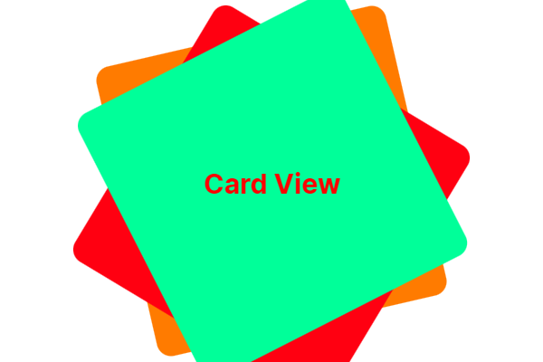
Creating an interactive card-based interface in Jetpack Compose is easier than ever. Today, we will explore how to implement a smooth Card Animation in Jetpack using swipe or tap gestures on cards with the CardSwipeOrTap composable. This approach is perfect for modern UI designs where users interact with content via gestures.
Main Activity Setup
We start by setting up the MainActivity that uses a Scaffold layout inside the RecyclerViewTheme. This ensures that our UI fills the entire screen while providing padding to our card interactions.
The CardSwipeOrTap composable manages the card stack. It uses a Box to overlay cards on top of each other and applies a slight rotation and vertical offset for a realistic stacked effect.
Each card is individually rendered using the CardItem composable. We use a simple CoroutineScope to delay actions and allow for smooth animations between swipe or tap events.
@Composable
fun CardSwipeOrTap(modifier: Modifier = Modifier) {
    val scope = rememberCoroutineScope()
    var cards by remember { mutableStateOf(listOf(0, 1, 2)) }
    var isAnimating by remember { mutableStateOf(false) }

    val cardColors = listOf(
        Color(0xFFFF9800), // Orange
        Color(0xFFF44336), // Red
        Color(0xFF00E676)  // Light Green
    )

    Box(
        modifier = modifier.fillMaxSize().padding(32.dp),
        contentAlignment = Alignment.Center
    ) {
        cards.reversed().forEachIndexed { index, cardIndex ->
            CardItem(
                index = cardIndex,
                color = cardColors[cardIndex % cardColors.size],
                rotation = if (index == 0) 0f else if (index == 1) -10f else 10f,
                offsetY = (index * 20).dp,
                isTop = index == cards.size - 1,
                isAnimating = isAnimating,
                onSwiped = {
                    if (!isAnimating) {
                        isAnimating = true
                        scope.launch {
                            kotlinx.coroutines.delay(300)
                            val updated = cards.toMutableList()
                            val removed = updated.removeAt(0)
                            updated.add(removed)
                            cards = updated
                            isAnimating = false
                        }
                    }
                }
            )
        }
    }
}
Animating Card Movement with CardItem
The CardItem composable handles the animation when a user swipes or taps a card. It uses animateDpAsState and animateFloatAsState to animate the card’s offset and opacity, giving the appearance of a disappearing card when an interaction occurs.
With just a few lines of Kotlin code, you can create a stunning card swipe and tap animation in Jetpack Compose. This approach is not only visually appealing but also highly interactive, offering a smooth user experience without the complexity of a traditional RecyclerView setup. Try it out in your next Android app project!
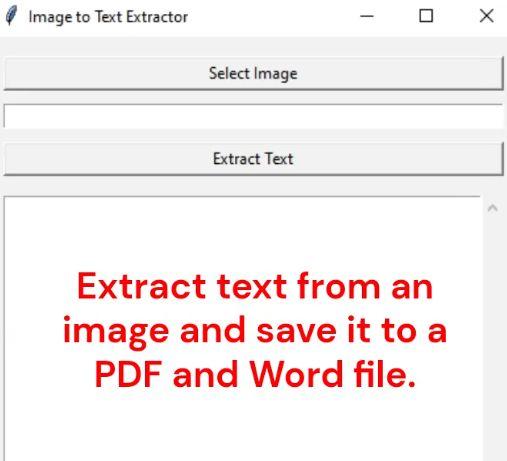
Discover how to easily Extract the text From image using python to pdf and word file. This guide shows you how to build a Python Tkinter application that extracts text from images and saves it into Word or PDF files effortlessly.
Introduction
Manually extracting text from images can be a tedious task. Thankfully, Python offers powerful libraries like pytesseract and Tkinter to automate this process. In this tutorial, you’ll learn how to Extract the text From an image to pdf and word file by creating an easy-to-use desktop application. This project is perfect for beginners exploring GUI development and OCR (Optical Character Recognition).
Technologies Used
Python – Programming language
Tkinter – GUI toolkit for Python
pytesseract – Optical Character Recognition (OCR) tool
Pillow – Image processing library
fpdf – PDF creation library
python-docx – Word document generation library
Installation Guide for Technologies Used
Before building the project to Extract the Text from an Image Using Python, make sure to install the following required libraries and tools.
1. Install Python
Make sure you have Python installed. You can download it from the official site: Download Python.
2. Install Required Python Libraries
# Install tkinter (already included with Python on most systems)
# For Linux, you can install manually:
sudo apt-get install python3-tk

# Install pytesseract
pip install pytesseract

# Install Pillow for image processing
pip install Pillow

# Install fpdf to create PDF files
pip install fpdf

# Install python-docx to create Word documents
pip install python-docx
3. Install Tesseract-OCR Engine
Since pytesseract is only a wrapper, you also need to install the Tesseract-OCR engine:
Adjust the path if you installed Tesseract in a different location.
5. (Optional) Create a requirements.txt
To install all packages at once, you can create a requirements.txt file with the following content:
pytesseract
Pillow
fpdf
python-docx
Then run:
pip install -r requirements.txt
Now your Python environment is fully ready to build the project and extract text from images easily!
Project Overview: Extract the text From an image to pdf and word file
This simple Python application allows users to:
Select an image (formats: PNG, JPG, BMP, TIFF)
Extract text using OCR
View extracted text in a scrollable text box
Save extracted text as a Word (.docx) file
Save extracted text as a PDF (.pdf) file
How It Works
1. Selecting an Image
Click the “Select Image” button to open a file dialog where you can choose an image file. The application supports PNG, JPG, BMP, and TIFF formats.
2. Extracting Text
After selecting an image, click “Extract Text”. The app uses Tesseract OCR to scan the image and retrieve all readable text, which is displayed inside a scrollable text widget.
3. Saving as Word or PDF
Once the text is extracted, you can choose to save it as a Word document or a PDF file. The application ensures Unicode font support for multi-language text.
pdf = FPDF()
pdf.add_page()
pdf.add_font('DejaVu', '', font_path, uni=True)
pdf.set_font('DejaVu', '', 12)
for line in text.split('\n'):
pdf.multi_cell(0, 10, line)
pdf.output(filepath)
Benefits of Automating Text Extraction
Saves time compared to manual typing
Improves data entry accuracy
Streamlines document management
Boosts productivity for businesses and individuals
Complete Code extract-text.py
import tkinter as tk
from tkinter import filedialog, messagebox, ttk
from tkinter.scrolledtext import ScrolledText
from PIL import Image
import pytesseract
from docx import Document
from fpdf import FPDF
import os
import threading
# Set path to tesseract.exe
pytesseract.pytesseract.tesseract_cmd = r"C:\Program Files\Tesseract-OCR\tesseract.exe" # Adjust if needed
def select_image():
filepath = filedialog.askopenfilename(
title="Select an image file",
filetypes=[("Image Files", "*.png *.jpg *.jpeg *.bmp *.tiff")]
)
if filepath:
entry_file.delete(0, tk.END)
entry_file.insert(0, filepath)
def extract_text_threaded():
threading.Thread(target=extract_text).start()
def extract_text():
image_path = entry_file.get()
if not os.path.exists(image_path):
messagebox.showerror("Error", "Image file does not exist!")
return
try:
progress_bar.place(relx=0.5, rely=0.5, anchor="center") # Centered inside text box
progress_bar.start()
img = Image.open(image_path)
text = pytesseract.image_to_string(img)
if not text.strip():
messagebox.showinfo("No Text", "No text detected in the image.")
return
text_box.config(state=tk.NORMAL)
text_box.delete(1.0, tk.END)
text_box.insert(tk.END, text)
text_box.config(state=tk.NORMAL)
except Exception as e:
messagebox.showerror("Error", str(e))
finally:
progress_bar.stop()
progress_bar.place_forget() # Hide progress bar
def save_as_word():
text = text_box.get(1.0, tk.END).strip()
if not text:
messagebox.showwarning("Warning", "No text to save!")
return
filepath = filedialog.asksaveasfilename(
defaultextension=".docx",
filetypes=[("Word Document", "*.docx")]
)
if filepath:
try:
doc = Document()
doc.add_paragraph(text)
doc.save(filepath)
messagebox.showinfo("Saved", f"Text saved as Word file:\n{filepath}")
except Exception as e:
messagebox.showerror("Error", str(e))
def save_as_pdf():
text = text_box.get(1.0, tk.END).strip()
if not text:
messagebox.showwarning("Warning", "No text to save!")
return
filepath = filedialog.asksaveasfilename(
defaultextension=".pdf",
filetypes=[("PDF file", "*.pdf")]
)
if filepath:
try:
pdf = FPDF()
pdf.add_page()
# Add a Unicode font (DejaVuSans.ttf must be in the same folder)
font_path = os.path.join(os.path.dirname(__file__), r"D:\Python\extract-text\DejavuSans.ttf")
pdf.add_font('DejaVu', '', font_path, uni=True)
pdf.set_font('DejaVu', '', 12)
for line in text.split('\n'):
pdf.multi_cell(0, 10, line)
pdf.output(filepath)
messagebox.showinfo("Saved", f"Text saved as PDF file:\n{filepath}")
except Exception as e:
messagebox.showerror("Error", str(e))
# Helper function to get correct path for icon
def resource_path(relative_path):
try:
# PyInstaller creates a temp folder and stores path in _MEIPASS
base_path = sys._MEIPASS
except Exception:
base_path = os.path.abspath(".")
return os.path.join(base_path, relative_path)
# --- GUI ---
root = tk.Tk()
root.title("Image to Text Extractor")
root.minsize(400, 600) # Minimum window size
frame = tk.Frame(root, padx=10, pady=10)
frame.pack(fill=tk.BOTH, expand=True)
# Widgets
btn_select = tk.Button(frame, text="Select Image", command=select_image)
entry_file = tk.Entry(frame, width=50)
btn_extract = tk.Button(frame, text="Extract Text", command=extract_text_threaded)
text_frame = tk.Frame(frame)
text_box = ScrolledText(text_frame, width=80, height=20, wrap=tk.WORD)
progress_bar = ttk.Progressbar(text_frame, orient=tk.HORIZONTAL, mode='indeterminate', length=200)
progress_bar.place_forget()
btn_save_word = tk.Button(frame, text="Save as Word", command=save_as_word)
btn_save_pdf = tk.Button(frame, text="Save as PDF", command=save_as_pdf)
# Layout function (dynamic)
def layout_widgets(event=None):
width = root.winfo_width()
# Clear old layout
for widget in frame.winfo_children():
widget.grid_forget()
widget.pack_forget()
if width < 500: # Mobile Layout
btn_select.pack(pady=5, fill=tk.X)
entry_file.pack(pady=5, fill=tk.X)
btn_extract.pack(pady=5, fill=tk.X)
text_frame.pack(pady=10, fill=tk.BOTH, expand=True)
text_box.pack(fill=tk.BOTH, expand=True)
btn_save_word.pack(pady=5, fill=tk.X)
btn_save_pdf.pack(pady=5, fill=tk.X)
else: # Desktop Layout
btn_select.grid(row=0, column=0, padx=5, pady=5)
entry_file.grid(row=0, column=1, padx=5, pady=5, sticky="ew")
btn_extract.grid(row=0, column=2, padx=5, pady=5)
frame.grid_columnconfigure(1, weight=1)
text_frame.grid(row=1, column=0, columnspan=3, pady=10, sticky="nsew")
text_box.pack(fill=tk.BOTH, expand=True)
btn_save_word.grid(row=2, column=0, pady=5)
btn_save_pdf.grid(row=2, column=2, pady=5)
# Make sure frame expands correctly
frame.pack(fill=tk.BOTH, expand=True)
# Bind resize event
root.bind("", layout_widgets)
# Initialize layout
layout_widgets()
root.mainloop()
By completing this project, you now know how to Extract the text From an image to pdf and word file using a Python Tkinter GUI application. This hands-on project introduces you to OCR technology and file conversion, which are valuable skills for automating tasks and improving workflow efficiency. You can extend this app by adding features like multi-image processing or cloud uploads to make it even more powerful!