How to Implement Clean Architecture in Flutter (Beginner Step-by-Step Guide)

If you want to write clean, scalable, and professional Flutter code, understanding Clean Architecture is essential.In this guide, we will focus only on the core concept of Clean Architecture:

  • ❌ No State Management
  • ❌ No Dependency Injection
  • βœ… Only core architecture (Domain + Data + Presentation)


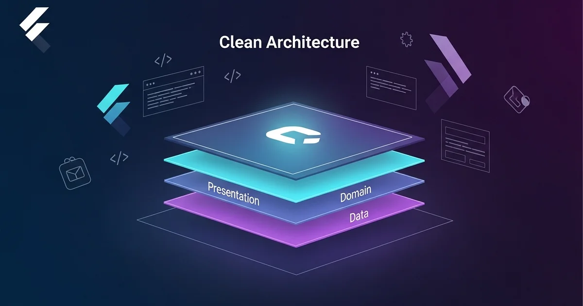
🧠 What is Clean Architecture?

Clean Architecture is a design approach where an application is divided into layers to achieve:

  • Well-organized code
  • Easier maintenance and updates
  • Better testability
  • Scalability for large applications


πŸ”‘ The Golden Rule

  • Dependencies always point inward
  • Inner layers are independent and do not know about outer layers

Presentation β†’ Domain β†’ Data


🧱 The 3 Core Layers


1. Domain Layer (Core Logic)

  • The brain of the application
  • Contains business rules
  • Written in pure Dart (no Flutter, no APIs)

2. Data Layer (Implementation)

  • Handles API calls or local database
  • Implements contracts defined in the Domain layer

3. Presentation Layer (UI)

  • Displays UI
  • Handles user interactions

πŸ“ Recommended Folder Structure

lib/
β”œβ”€β”€ features/
β”‚ └── user/
β”‚ β”œβ”€β”€ domain/
β”‚ β”œβ”€β”€ data/
β”‚ └── presentation/


πŸš€ Step-by-Step Implementation (API Example)

Let’s walk through a simple example:

πŸ‘‰ Fetch User from API


🧠 Step 1: Domain Layer (Start Here)

πŸ“ lib/features/user/domain/


βœ… 1.1 Entity (First File)

πŸ“ entities/user.dart

class User {
  final int id;
  final String name;

  User({required this.id, required this.name});
}

βœ” Represents core data
βœ” Has no dependency on external layers


βœ… 1.2 Repository (Abstract)

πŸ“ repositories/user_repository.dart

abstract class UserRepository {
  Future<User> getUser();
}

βœ” Defines what data is needed
βœ” Does not include implementation


βœ… 1.3 Use Case

πŸ“ usecases/get_user.dart

class GetUser {
  final UserRepository repository;

  GetUser(this.repository);

  Future<User> call() {
    return repository.getUser();
  }
}

βœ” Represents a business action
βœ” This is what the UI will call


πŸ’Ύ Step 2: Data Layer

πŸ“ lib/features/user/data/


βœ… 2.1 Model

πŸ“ models/user_model.dart

import '../../domain/entities/user.dart';

class UserModel extends User {
  UserModel({required int id, required String name})
      : super(id: id, name: name);

  factory UserModel.fromJson(Map<String, dynamic> json) {
    return UserModel(
      id: json['id'],
      name: json['name'],
    );
  }
}

βœ” Maps API response to your app structure


βœ… 2.2 Data Source (API Call)

πŸ“ datasources/user_remote_data_source.dart


class UserRemoteDataSource {
  Future<UserModel> getUser() async {
    // Fake API call
    await Future.delayed(Duration(seconds: 1));

    return UserModel(id: 1, name: "Ali");
  }
}

βœ” Contains actual API logic


βœ… 2.3 Repository Implementation

πŸ“ repositories/user_repository_impl.dart


class UserRepositoryImpl implements UserRepository {
  final UserRemoteDataSource remoteDataSource;

  UserRepositoryImpl(this.remoteDataSource);

  @override
  Future<User> getUser() async {
    return await remoteDataSource.getUser();
  }
}

βœ” Implements the Domain contract


🎨 Step 3: Presentation Layer (Simple UI)

πŸ“ lib/features/user/presentation/


βœ… Simple UI Page (Without State Management)

πŸ“ pages/user_page.dart


class UserPage extends StatefulWidget {
  @override
  _UserPageState createState() => _UserPageState();
}

class _UserPageState extends State<UserPage> {
  String text = "Press Button";

  void fetchUser() async {
    final dataSource = UserRemoteDataSource();
    final repository = UserRepositoryImpl(dataSource);
    final usecase = GetUser(repository);

    final user = await usecase();

    setState(() {
      text = user.name;
    });
  }

  @override
  Widget build(BuildContext context) {
    return Scaffold(
      body: Center(
        child: ElevatedButton(
          onPressed: fetchUser,
          child: Text(text),
        ),
      ),
    );
  }
}

βœ” Direct and simple connection
βœ” Easy for beginners (no Bloc, no Provider)


πŸ”„ Data Flow Explained

UI β†’ UseCase β†’ Repository β†’ DataSource β†’ API
API β†’ DataSource β†’ Repository β†’ UseCase β†’ UI


⚑ Recommended Development Order

  1. Entity
  2. Repository (abstract)
  3. Use Case
  4. Model
  5. Data Source
  6. Repository Implementation
  7. UI


❌ Common Mistakes to Avoid

  • Calling APIs directly from UI ❌
  • Mixing Models and Entities ❌
  • Importing Flutter into Domain layer ❌


🎯 Final Summary

  • Domain β†’ Defines business logic
  • Data β†’ Implements logic
  • Presentation β†’ Displays results

πŸ‘‰ β€œAlways start with the Domain β€” never with the UI.”


πŸš€ What’s Next?

  • State Management (Bloc, Riverpod)
  • Dependency Injection (e.g., get_it)

Clean Architecture is the foundation everything else builds on.


πŸ“š Explore More Blogs

If you found this guide helpful, explore more mobile app development articles on our blog.


How to Make a Custom Balloon Burst Animation Widget in Flutter

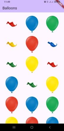
In this article, we learn an animation concept for a balloon burst animation.Β This may look like a simple animation, but the concept behind it is at an advanced level. By using this, you can create your own animations for celebrations, birthdays, and order-completed pages in shopping apps, etc.

The main purpose of this article is to provide the source code for this balloon burst animation so that you can use it in your own application.


Dart Files for the Balloon Burst Animation Widget

The source code includes the following files:

  • balloon.dart
  • balloon_item.dart
  • particle.dart
  • particle_controller.dart
  • particle_painter.dart
  • balloon_burst_widget.dart

How to Use the Balloon Burst Animation Widget in Your App

Copy all the files mentioned above from the source code and paste them into your own project. Then use the widget class β€œBalloonBurstWidget” from the balloon_burst_widget.dart file.
After that, pass a list of your own images to this widget.

For testing purposes, you can also copy all the images from the source code assets folder.


Download Source Code

Want more ready-to-use source code for your projects? Explore our Source Codes page, where you’ll find examples from various programming languages and frameworks that can help you bring your ideas to life.

How to Use Jetpack Compose and Flutter to Make a Custom Loading Animation for Mobile App

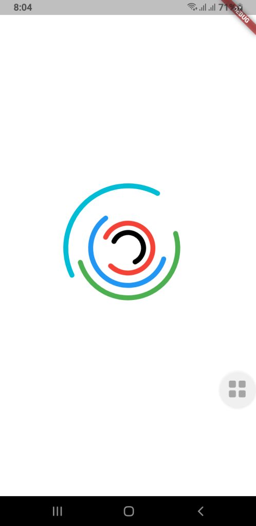
Loading indicators are an important part of making a mobile experience look and feel smooth and professional. A lot of developers use built-in progress bars or spinners, but custom animations can make your app look different, help with branding, and make it feel like it’s flowing.

This guide will show you how to use Jetpack Compose (for Android) and Flutter to make a more complex custom loading animation for mobile apps. The goal is to make a fun-to-watch multi-ring spinner animation that spins in different directions, at different speeds, and with arcs of different shapes. Your UI will look fresh and new with this.

⭐ Why It’s Important to Have a Custom Loading Animation

A good loading animation will give you

  • More interaction with users
  • Different looks for each brand
  • There are no issues when you switch screens.
  • It feels like a premium app.

People believe they don’t have to wait as long.

You can make complicated animated parts with very little code using Jetpack Compose and Flutter, two modern UI frameworks.

Jetpack Compose for Android lets you make your own loading animation.

Developers can make UI in a declarative way with Jetpack Compose and use powerful APIs to add animations. We want to make a spinner with a lot of rings that are stacked on top of each other and spin by themselves.

1. Model for Setting Up a Ring

First, we discuss the features of each animated ring:

  • Radius

  • Color

  • Stroke width

  • Opacity

  • Arc length

  • Direction of rotation

  • Rotation speed

These properties allow full customization for each ring in the spinner.

RingConfig Model

 
data class RingConfig(
    val id: String,
    val radius: Float,
    val color: Color,
    val strokeWidth: Float,
    val opacity: Float,
    val arcLength: Float,
    val direction: Int,     // +1 or -1
    val speed: Float        // seconds per rotation
)
 
2. Creating the Custom Loading Animation

For smooth animations that never end, Compose has rememberInfiniteTransition.

Each ring has its own float animation that shows how it turns:

  • Independent rotation for each ring

  • Control over speed and direction

  • Smooth, continuous animation

3. Drawing on a Canvas

There are dashed arcs and a rotating effect on the rings drawn on Canvas.

This setup allows:

  • Changeable radius
  • Stroke width that can be changed
  • Dividing arcs into parts
  • Each layer can move by itself.

These pieces work together to make a loading animation that looks great and works well with Android apps that are up to date.

Spinner Composable Function


@Composable
fun Loading(
    rings: List,
    size: Dp = 400.dp
) {
    //  All animations must be created here, NOT inside Canvas
    val transition = rememberInfiniteTransition()

    // Pre-calc animations for each ring
    val rotations = rings.map { ring ->
        transition.animateFloat(
            initialValue = 0f,
            targetValue = ring.direction * 360f,
            animationSpec = infiniteRepeatable(
                animation = tween(
                    durationMillis = (ring.speed * 1000).toInt(),
                    easing = LinearEasing
                ),
                repeatMode = RepeatMode.Restart
            )
        )
    }

    Box(
        modifier = Modifier.size(size),
    ) {
        Canvas(modifier = Modifier.fillMaxSize()) {

            val center = Offset(this.size.width / 2, this.size.height / 2)

            rings.forEachIndexed { index, ring ->
                val rotation = rotations[index].value

                val circumference = 2f * PI.toFloat() * ring.radius
                val dashArray = circumference * ring.arcLength
                val dashGap = circumference - dashArray

                rotate(rotation, pivot = center) {
                    drawCircle(
                        color = ring.color.copy(alpha = ring.opacity),
                        radius = ring.radius,
                        center = center,
                        style = Stroke(
                            width = ring.strokeWidth,
                            cap = StrokeCap.Round,
                            pathEffect = PathEffect.dashPathEffect(
                                floatArrayOf(dashArray, dashGap),
                                phase = 0f
                            )
                        )
                    )
                }
            }
        }
    }
}


How to use this Loading Composable Function

MainActivity.kt

     
class MainActivity : ComponentActivity() {
    override fun onCreate(savedInstanceState: Bundle?) {
        super.onCreate(savedInstanceState)
        enableEdgeToEdge()
        setContent {
            LoaderTheme {
                CustomSpinLoading()
            }
        }
    }
}

@Composable
fun CustomSpinLoading() {
    val rings = listOf(
        RingConfig(
            id = "a",
            radius = 50f,
            color = Color.Black,
            strokeWidth = 14f,
            opacity = 1f,
            arcLength = 0.6f,
            direction = -1,
            speed = 6f
        ),
        RingConfig(
            id = "b",
            radius = 80f,
            color = Color.Red,
            strokeWidth = 14f,
            opacity = 1f,
            arcLength = 0.8f,
            direction = 1,
            speed = 8f
        ),
        RingConfig(
            id = "c",
            radius = 120f,
            color = Color.Blue,
            strokeWidth = 14f,
            opacity = 0.9f,
            arcLength = 0.6f,
            direction = -1,
            speed = 9f
        ),
        RingConfig(
            id = "d",
            radius = 160f,
            color = Color.Green,
            strokeWidth = 14f,
            opacity = 0.8f,
            arcLength = 0.5f,
            direction = 1,
            speed = 9f
        ),

        RingConfig(
            id = "e",
            radius = 200f,
            color = Color.Cyan,
            strokeWidth = 14f,
            opacity = 0.8f,
            arcLength = 0.4f,
            direction = -1,
            speed = 8f
        )
    )

    Loading(rings = rings, size = 400.dp)
}


🟩 Flutter Loading Animation That You Can Change

Flutter has its own animation system that is based on controllers and custom painters, but it works in a similar way to declarative programming.

Check out the code below:

RingConfig.dart Model Class

 
class RingConfig {
final String id;
final double radius;
final Color color;
final double strokeWidth;
final double opacity;
final double arcLength;
final int direction; // +1 or -1
final double speed; // seconds per rotation

RingConfig({
required this.id,
required this.radius,
required this.color,
required this.strokeWidth,
required this.opacity,
required this.arcLength,
required this.direction,
required this.speed,
});
}

 
Drawing with CustomPainter

 
import 'dart:math';
import 'package:flutter/cupertino.dart';
import 'RingConfig.dart';

class LoadingPainter extends CustomPainter {
final List<RingConfig> rings;
final List<Animation<double>> rotations;

LoadingPainter(this.rings, this.rotations);

@override
void paint(Canvas canvas, Size size) {
final center = Offset(size.width / 2, size.height / 2);

for (int i = 0; i < rings.length; i++) {
final ring = rings[i];
final rotation = rotations[i].value;

final paint = Paint()
..color = ring.color.withValues()
..style = PaintingStyle.stroke
..strokeWidth = ring.strokeWidth
..strokeCap = StrokeCap.round;

final circumference = 2 * pi * ring.radius;
final dashLength = circumference * ring.arcLength;
final dashGap = circumference - dashLength;

final circlePath = Path()
..addOval(Rect.fromCircle(center: center, radius: ring.radius));

final dashedPath = _dashPath(circlePath, dashLength, dashGap);

canvas.save();
canvas.translate(center.dx, center.dy);
canvas.rotate(rotation * pi / 180);
canvas.translate(-center.dx, -center.dy);

canvas.drawPath(dashedPath, paint);

canvas.restore();
}
}

@override
bool shouldRepaint(covariant CustomPainter oldDelegate) => true;
}

Path _dashPath(Path source, double dashLength, double dashGap) {
final Path dest = Path();
double distance = 0.0;

for (final metric in source.computeMetrics()) {
while (distance < metric.length) {
final next = distance + dashLength;
dest.addPath(metric.extractPath(distance, next), Offset.zero);
distance = next + dashGap;
}
distance = 0.0;
}
return dest;
}

 
Custom Loading Widget


import 'package:flutter/cupertino.dart';
import 'RingConfig.dart';
import 'LoadingPainter.dart';
import 'package:flutter/material.dart';


class Loading extends StatefulWidget {
  final List<RingConfig> rings;
  final double size;

  const Loading({super.key, required this.rings, this.size = 400});

  @override
  State<Loading> createState() => _LoadingState();
}

class _LoadingState extends State<Loading> with TickerProviderStateMixin {
  late List<AnimationController> controllers;
  late List<Animation<double>> rotations;

  @override
  void initState() {
    super.initState();

    controllers = widget.rings.map((ring) {
      return AnimationController(
        duration: Duration(milliseconds: (ring.speed * 1000).toInt()),
        vsync: this,
      )..repeat();
    }).toList();

    rotations = List.generate(
      widget.rings.length,
      (i) => Tween<double>(
        begin: 0,
        end: widget.rings[i].direction * 360,
      ).animate(controllers[i]),
    );
  }

  @override
  void dispose() {
    for (var controller in controllers) {
      controller.dispose();
    }
    super.dispose();
  }

  @override
  Widget build(BuildContext context) {
    return SizedBox(
      width: widget.size,
      height: widget.size,
      child: AnimatedBuilder(
        animation: Listenable.merge(controllers),
        builder: (_, __) {
          return CustomPaint(painter: LoadingPainter(widget.rings, rotations));
        },
      ),
    );
  }
}


How to use this Loading widget in Flutter?

main.dart


import 'package:flutter/material.dart';

import 'RingConfig.dart';
import 'Loading.dart';

void main() {
  runApp(const MyApp());
}

class MyApp extends StatelessWidget {
  const MyApp({super.key});

  // This widget is the root of your application.
  @override
  Widget build(BuildContext context) {
    return MaterialApp(
      title: 'Custom Loading',
      theme: ThemeData(
        colorScheme: ColorScheme.fromSeed(seedColor: Colors.deepPurple),
      ),
      home: const MyHomePage(title: 'Loading Animation'),
    );
  }
}

class MyHomePage extends StatefulWidget {
  const MyHomePage({super.key, required this.title});

  final String title;

  @override
  State<MyHomePage> createState() => _MyHomePageState();
}

class _MyHomePageState extends State<MyHomePage> {
  @override
  Widget build(BuildContext context) {
    final rings = [
      RingConfig(
        id: "a",
        radius: 25,
        color: Colors.black,
        strokeWidth: 8,
        opacity: 1,
        arcLength: 0.6,
        direction: -1,
        speed: 6,
      ),
      RingConfig(
        id: "b",
        radius: 40,
        color: Colors.red,
        strokeWidth: 8,
        opacity: 1,
        arcLength: 0.8,
        direction: 1,
        speed: 8,
      ),
      RingConfig(
        id: "c",
        radius: 60,
        color: Colors.blue,
        strokeWidth: 8,
        opacity: 0.9,
        arcLength: 0.6,
        direction: -1,
        speed: 9,
      ),
      RingConfig(
        id: "d",
        radius: 80,
        color: Colors.green,
        strokeWidth: 8,
        opacity: 0.8,
        arcLength: 0.5,
        direction: 1,
        speed: 9,
      ),
      RingConfig(
        id: "e",
        radius: 100,
        color: Colors.cyan,
        strokeWidth: 8,
        opacity: 0.8,
        arcLength: 0.4,
        direction: -1,
        speed: 8,
      ),
    ];

    return Scaffold(
      backgroundColor: Colors.white,
      body: Center(child: Loading(rings: rings, size: 400)),
    );
  }
}


Download Source Code

Final Thoughts

You can make a loading animation just for mobile apps (Jetpack Compose and Flutter), and it can be very rewarding. Both frameworks give developers everything they need to make motion graphics that are expressive without having to use animated assets or libraries from other companies.

This multi-ring spinner is a great example of:

  • Design of animations that can be changed
  • Framework-level APIs for drawing
  • Animation loops that go on forever and work well
  • Consistency between platforms
    A well-designed loader can make your user interface a lot better, whether you’re making apps just for Android or for more than one platform.

Spin Wheel App Source Code – Java, Jetpack Compose and Flutter

Looking to build a fun and engaging spin-the-wheel app for giveaways, lucky draws, games, or random selections? This post covers a complete mini wheel spinner app built with:

  • βœ… Android Java using Custom Views
  • βœ… Android Jetpack Compose
  • βœ… Cross-platform Flutter (Android, iOS, and Web)

It’s lightweight, beautifully animated, and perfect for learners and developers. Whether you’re creating a decision-maker app or adding gamification to your product β€” this is your go-to solution.


Download Source Code

πŸš€ Key Features

  • 🎯 Smooth spinning animation with auto-colored segments
  • 🧠 Callback on spin result (Java/Compose)
  • πŸ“¦ 3 complete projects: Android Java, Jetpack Compose & Flutter
  • πŸ” Reusable spinner logic for games, quizzes, and lucky draw
  • πŸ“± Supports Android & Web (via Flutter)

πŸ“ What’s Inside the ZIP

This repository includes a ZIP file with three fully working source code projects:

  • Android Java: Classic implementation using custom `View`
  • Jetpack Compose: Modern declarative UI with Compose
  • Flutter: Cross-platform app using Dart

βš™οΈ How to Use

  1. Download the ZIP using the button above
  2. Unzip and open the desired project in Android Studio or VS Code
  3. Click Run and enjoy your animated spinner!

πŸ”— Get more awesome source codes at: Source Codes


Tags: android java spin wheel, flutter lucky draw app, wheel spinner compose, source code android spinner, alsaeeddev, gamification app, random picker app