How to Build a Real-Time Blood Pressure App Android UI Using Jetpack Compose

Modern health applications—whether you’re building a blood pressure app Android, an ECG app Android, or a heart rate monitor Android—require interfaces that are clean, smooth, and capable of updating in real time. With Jetpack Compose, Android developers can design advanced animated dashboards using only a few composable functions.

In this guide, we’ll walk through a complete real-time vital monitoring UI built entirely with Canvas, animations, and Jetpack Compose.
The final setup includes:

  • A pressure gauge (mmHg) for blood pressure visualization
  • A real-time ECG waveform renderer
  • A vital simulator that generates dynamic heartbeat, SpO₂, and pressure values

If you’re creating a health monitoring interface, these components provide a great foundation.

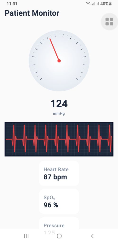
1. The Blood Pressure Gauge’s (PressureGauge) user interface

The PressureGauge composable makes a round gauge that is fully animated and looks like the dials on professional sphygmomanometers used in clinics.
Important parts of the gauge

  •  The needle moves smoothly.
  •  It ticks every 10 mmHg.
  •  Major ticks every 20 mmHg.
  •  A soft radial gradient background.
  • A 270° sweep (–135° to +135°), just like a medical pressure meter.

The needle moves smoothly toward the new pressure value when you use animateFloatAsState(). This makes it feel like a real machine, which is great for the UI of an Android blood pressure app.

PressureGauge Code

  
@Composable
fun PressureGauge(
    pressure: Float,
    maxPressure: Float = 300f,
    modifier: Modifier = Modifier
) {
    val animatedPressure by animateFloatAsState(
        targetValue = pressure,
        animationSpec = tween(800, easing = LinearOutSlowInEasing)
    )

    val size = 260.dp
    val center = size / 2

    Box(
        modifier = modifier
            .size(size)
            .padding(12.dp),
        contentAlignment = Alignment.Center
    ) {
        Canvas(modifier = Modifier.fillMaxSize()) {

            val w = this.size.width
            val h = this.size.height
            val cx = w / 2
            val cy = h / 2

            val rotation = -135f + (animatedPressure.coerceAtMost(maxPressure) / maxPressure) * 270f

            // BACKGROUND GRADIENT
            drawCircle(
                brush = Brush.radialGradient(
                    colors = listOf(Color.White, Color(0xFFE2E8F0))
                ),
                radius = w * 0.45f,
                center = Offset(cx, cy)
            )

            // TICKS
            for (i in 0..maxPressure.toInt() step 10) {
                val angle = -135f + (i / maxPressure) * 270f
                val rad = Math.toRadians((angle - 90).toDouble())

                val major = i % 20 == 0
                val length = if (major) 18f else 10f
                val width = if (major) 2f else 1f

                val rOuter = w * 0.4f
                val rInner = rOuter - length

                val x1 = cx + rOuter * cos(rad).toFloat()
                val y1 = cy + rOuter * sin(rad).toFloat()
                val x2 = cx + rInner * cos(rad).toFloat()
                val y2 = cy + rInner * sin(rad).toFloat()

                drawLine(
                    color = if (major) Color(0xFF334155) else Color(0xFF94A3B8),
                    start = Offset(x1, y1), end = Offset(x2, y2),
                    strokeWidth = width
                )
            }

            // NEEDLE
            rotate(rotation, pivot = Offset(cx, cy)) {
                drawLine(
                    start = Offset(cx, cy),
                    end = Offset(cx, cy - w * 0.35f),
                    color = Color(0xFFEF4444),
                    strokeWidth = 6f,
                    cap = StrokeCap.Round
                )
                drawCircle(
                    color = Color(0xFFEF4444),
                    center = Offset(cx, cy),
                    radius = 10f
                )
            }
        }
    }

    Column(horizontalAlignment = Alignment.CenterHorizontally) {
        Text(
            text = animatedPressure.toInt().toString(),
            fontSize = 34.sp,
            fontWeight = FontWeight.Bold,
            color = Color(0xFF1E293B)
        )
        Text(
            text = "mmHg",
            color = Color(0xFF64748B),
            fontSize = 12.sp
        )
    }
}
 
2. PulseECG – A real-time renderer for ECG waveforms

The waveform is the most important visual part of an ECG app for Android. The PulseECG composable makes it look like an ECG trace is moving by constantly moving a list of points.
How it works
Keeps a list of 120 points that keeps changing
Changes values based on two conditions:
active: ECG is working
beating: heartbeats
Makes a dark grid that looks like a medical one
Draws a glowing red ECG path to make it look real
It looks a lot like real ECG monitor output and can easily take real medical data.

PulseECG Code

  
@Composable
fun PulseECG(
    active: Boolean,
    beating: Boolean,
    modifier: Modifier = Modifier
) {
    var points by remember { mutableStateOf(List(120) { 50f }) }
    var tick by remember { mutableStateOf(0) }

    LaunchedEffect(active, beating) {
        while (true) {
            delay(40)

            val new = points.toMutableList()
            new.removeAt(0)

            val updated = when {
                !active -> 50f
                !beating -> 50f + (Math.random().toFloat() - 0.5f) * 8f
                else -> when (tick % 12) {
                    0 -> 50f
                    1 -> 30f
                    2 -> 95f
                    3 -> 10f
                    4 -> 60f
                    else -> 50f
                }
            }
            new.add(updated)
            points = new

            if (beating) tick++
        }
    }

    Canvas(
        modifier = modifier
            .fillMaxWidth()
            .height(110.dp)
            .background(Color(0xFF0F172A))
            .padding(4.dp)
    ) {
        val w = size.width
        val h = size.height

        // GRID
        drawRect(Color(0xFF1E293B))
        for (x in 0 until w.toInt() step 20)
            drawLine(Color(0xFF334155), Offset(x.toFloat(), 0f), Offset(x.toFloat(), h))
        for (y in 0 until h.toInt() step 20)
            drawLine(Color(0xFF334155), Offset(0f, y.toFloat()), Offset(w, y.toFloat()))

        // ECG line
        val path = Path()
        points.forEachIndexed { i, v ->
            val x = (i / points.size.toFloat()) * w
            val y = h - (v / 100f) * h
            if (i == 0) path.moveTo(x, y) else path.lineTo(x, y)
        }

        // Glow
        drawPath(
            path = path,
            color = Color(0xFFEF4444).copy(alpha = 0.4f),
            style = Stroke(width = 8f)
        )

        drawPath(
            path = path,
            color = Color(0xFFEF4444),
            style = Stroke(width = 3f)
        )

    }
}
 
3. VitalSimulator – Generating Real-Time Readings

For demo purposes—or previewing UI—you can use VitalSimulator, a small composable that generates random:

  • Blood pressure
  • Heart rate (BPM)
  • SpO₂ oxygen level

This is especially useful while building a heart rate monitor Android interface.

VitalSimulator Code

 
@Composable
fun VitalSimulator(): Triple<Float, Float, Float> {
    var pressure by remember { mutableStateOf(120f) }
    var bpm by remember { mutableStateOf(75f) }
    var spo2 by remember { mutableStateOf(97f) }

    LaunchedEffect(Unit) {
        while (true) {
            delay(1500)
            pressure = (110..135).random().toFloat()
            bpm = (72..90).random().toFloat()
            spo2 = (96..99).random().toFloat()
        }
    }

    return Triple(pressure, bpm, spo2)
}
Putting It All Together

By combining these composables, you can build a polished dashboard showing:

  • Animated blood pressure
  • Real-time ECG waveform
  • BPM and SpO₂ levels

This is an excellent base for medical-style dashboards or consumer wellness applications.


Download Source Code

Final Thoughts

Jetpack Compose makes it possible to build real-time health monitoring dashboards with only a few clean, efficient composables. Whether you’re working on a blood pressure app Android, an ECG app Android, or a heart rate monitor Android, these components give you a professional, animated, and scalable UI foundation.

Stunning Custom Analog Clock in Android – Java & Kotlin

Want to design a custom analog clock in Android? In this post, you’ll learn how to create one using both Java and Kotlin. Whether you’re building a utility app, dashboard UI, or simply improving your UI skills, this is the perfect project to implement a working analog clock in Android.

🎯 What’s Inside This Project?

You’ll get the complete source code for both languages, canvas-based drawing, second-by-second ticking hands, and a beautiful rounded design. Let’s dive into development!

✅ What You’ll Learn

  • How to draw a custom analog clock using Canvas
  • Java and Kotlin implementations side by side
  • Center dot, circular frame, and dynamic ticking hands
  • Modern, responsive UI layout for all screen sizes

This article provides two versions: AnalogClockView.java and AnalogClockViewKotlin.kt. You can use either based on your language preference.

📄 XML Layout

To use the custom clock in your activity, add this to your activity_main.xml:

<?xml version="1.0" encoding="utf-8"?>
<RelativeLayout xmlns:android="http://schemas.android.com/apk/res/android"
    xmlns:tools="http://schemas.android.com/tools"
    android:layout_width="match_parent"
    android:layout_height="match_parent"
    tools:context=".MainActivity">

    <www.alsaeeddev.clock.AnalogClockView
        android:id="@+id/analogClock"
        android:layout_width="match_parent"
        android:layout_height="match_parent"
        android:layout_centerInParent="true" />

</RelativeLayout>

📦 Java Code: AnalogClockView.java

 
package www.alsaeeddev.clock;
import android.content.Context;
import android.graphics.Canvas;
import android.graphics.Color;
import android.graphics.Paint;
import android.graphics.Rect;
import android.util.AttributeSet;
import android.view.View;

import java.util.Calendar;

public class AnalogClockView extends View {

    private Paint paint;
    private int width, height, radius;
    private int padding = 0;
    private int numeralSpacing = 30;
    private int handTruncation, hourHandTruncation;
    private final int[] numbers = {1,2,3,4,5,6,7,8,9,10,11,12};
    private Rect textBounds = new Rect();

    public AnalogClockView(Context context) {
        super(context);
        init();
    }

    public AnalogClockView(Context context, AttributeSet attrs) {
        super(context, attrs);
        init();
    }

    private void init() {
        paint = new Paint();
    }

    @Override
    protected void onDraw(Canvas canvas) {
        width = getWidth();
        height = getHeight();
        int min = Math.min(width, height);
        radius = min / 2 - 40;

        canvas.drawColor(Color.parseColor("#928dab")); // Background

        // Draw clock background
        paint.reset();
        paint.setColor(Color.parseColor("#b3f6f8"));
        paint.setStyle(Paint.Style.FILL);
        canvas.drawCircle((float) width /2, (float) height /2, radius + 30, paint);

        paint.setStyle(Paint.Style.STROKE);
        paint.setColor(Color.parseColor("#9e7419"));
        paint.setStrokeWidth(8f);
        canvas.drawCircle((float) width /2, (float) height /2, radius + 30, paint);

        // Draw center dot
        paint.setStyle(Paint.Style.FILL);
        paint.setColor(Color.BLACK);
        canvas.drawCircle((float) width /2, (float) height /2, 12, paint);

        // Draw clock numbers
        paint.setTextSize(40);
        paint.setColor(Color.BLACK);
        for (int number : numbers) {
            String tmp = String.valueOf(number);
            paint.getTextBounds(tmp, 0, tmp.length(), textBounds);
            double angle = Math.PI / 6 * (number - 3);
            int x = (int)((double) width /2 + Math.cos(angle) * (radius - numeralSpacing) - (double) textBounds.width() /2);
            int y = (int)((double) height /2 + Math.sin(angle) * (radius - numeralSpacing) + (double) textBounds.height() /2);
            canvas.drawText(tmp, x, y, paint);
        }

        // Get time
        Calendar calendar = Calendar.getInstance();
        int hour = calendar.get(Calendar.HOUR);
        int minute = calendar.get(Calendar.MINUTE);
        int second = calendar.get(Calendar.SECOND);

        drawHand(canvas, (hour + minute / 60.0) * 5f, true, false); // Hour hand
        drawHand(canvas, minute, false, false);                     // Minute hand
        drawHand(canvas, second, false, true);                      // Second hand

        postInvalidateDelayed(1000);
        invalidate();
    }


// draw the clock hands
    private void drawHand(Canvas canvas, double loc, boolean isHour, boolean isSecond) {
        double angle = Math.PI * loc / 30 - Math.PI / 2;
        int handRadius = isHour ? radius - 120 : radius - 60;
        if (isSecond) handRadius = radius - 40;

        paint.setColor(isSecond ? Color.parseColor("#e74c3c") : Color.BLACK);
        paint.setStrokeWidth(isSecond ? 4f : isHour ? 8f : 6f);
        canvas.drawLine((float) width /2, (float) height /2,
                (float)((double) width /2 + Math.cos(angle) * handRadius),
                (float)((double) height /2 + Math.sin(angle) * handRadius),
                paint);
    }
}

🧑‍💻 Kotlin Code: AnalogClockViewKotlin.kt

 
package www.alsaeeddev.clock

import android.content.Context
import android.graphics.Canvas
import android.graphics.Color
import android.graphics.Paint
import android.graphics.Rect
import android.util.AttributeSet
import android.view.View
import java.util.Calendar
import kotlin.math.cos
import kotlin.math.min
import kotlin.math.sin

class AnalogClockViewKotlin @JvmOverloads constructor(
    context: Context, attrs: AttributeSet? = null
) : View(context, attrs) {

    private val paint = Paint()
    private val numbers = (1..12).toList()
    private val textBounds = Rect()
    private var widthCenter = 0
    private var heightCenter = 0
    private var radius = 0

    init {
        paint.isAntiAlias = true
    }

    override fun onDraw(canvas: Canvas) {
        super.onDraw(canvas)

        widthCenter = width / 2
        heightCenter = height / 2
        radius = min(widthCenter, heightCenter) - 60

        drawBackground(canvas)
        drawCenterDot(canvas)
        drawNumbers(canvas)
        drawHands(canvas)

        postInvalidateDelayed(1000)
        invalidate()
    }

    private fun drawBackground(canvas: Canvas) {
        paint.reset()
        paint.isAntiAlias = true

        // Clock circle fill
        paint.color = Color.parseColor("#b3f6f8")
        paint.style = Paint.Style.FILL
        canvas.drawCircle(widthCenter.toFloat(), heightCenter.toFloat(), radius + 30f, paint)

        // Clock border
        paint.style = Paint.Style.STROKE
        paint.strokeWidth = 8f
        paint.color = Color.parseColor("#9e7419")
        canvas.drawCircle(widthCenter.toFloat(), heightCenter.toFloat(), radius + 30f, paint)
    }

    private fun drawCenterDot(canvas: Canvas) {
        paint.style = Paint.Style.FILL
        paint.color = Color.BLACK
        canvas.drawCircle(widthCenter.toFloat(), heightCenter.toFloat(), 12f, paint)
    }

    private fun drawNumbers(canvas: Canvas) {
        paint.textSize = 40f
        paint.color = Color.BLACK
        for (number in numbers) {
            val numStr = number.toString()
            paint.getTextBounds(numStr, 0, numStr.length, textBounds)
            val angle = Math.PI / 6 * (number - 3)
            val x = (widthCenter + cos(angle) * (radius - 30) - textBounds.width() / 2).toFloat()
            val y = (heightCenter + sin(angle) * (radius - 30) + textBounds.height() / 2).toFloat()
            canvas.drawText(numStr, x, y, paint)
        }
    }

    private fun drawHands(canvas: Canvas) {
        val calendar = Calendar.getInstance()
        val hour = calendar.get(Calendar.HOUR)
        val minute = calendar.get(Calendar.MINUTE)
        val second = calendar.get(Calendar.SECOND)

        drawHand(canvas, (hour + minute / 60f) * 5, isHour = true, isSecond = false)
        drawHand(canvas, minute.toFloat(), isHour = false, isSecond = false)
        drawHand(canvas, second.toFloat(), isHour = false, isSecond = true)
    }

    private fun drawHand(canvas: Canvas, loc: Float, isHour: Boolean, isSecond: Boolean) {
        val angle = Math.PI * loc / 30 - Math.PI / 2
        val handLength = when {
            isHour -> radius - 120
            isSecond -> radius - 30
            else -> radius - 60
        }

        paint.color = if (isSecond) Color.parseColor("#e74c3c") else Color.BLACK
        paint.strokeWidth = when {
            isHour -> 8f
            isSecond -> 4f
            else -> 6f
        }
        paint.style = Paint.Style.STROKE

        canvas.drawLine(
            widthCenter.toFloat(), heightCenter.toFloat(),
            (widthCenter + cos(angle) * handLength).toFloat(),
            (heightCenter + sin(angle) * handLength).toFloat(),
            paint
        )
    }
}


✅ Conclusion

Creating a custom analog clock in Android is a great way to explore Canvas drawing, custom views, and elegant UI development. Whether you choose Java or Kotlin, the outcome is a clean and dynamic clock component ready for your next project.

We used the Paint class extensively to draw shapes and text on the canvas. To learn more about its capabilities, see the official documentation here:
🔗 Android Developers

Don’t forget to share and follow Al Saeed for more hands-on Android tutorials.

Swipe and Tap Card Animation in Jetpack Compose

Creating an interactive card-based interface in Jetpack Compose is easier than ever. Today, we will explore how to implement a smooth Card Animation in Jetpack using swipe or tap gestures on cards with the CardSwipeOrTap composable. This approach is perfect for modern UI designs where users interact with content via gestures.

Main Activity Setup

We start by setting up the MainActivity that uses a Scaffold layout inside the RecyclerViewTheme. This ensures that our UI fills the entire screen while providing padding to our card interactions.

class MainActivity : ComponentActivity() {
    override fun onCreate(savedInstanceState: Bundle?) {
        super.onCreate(savedInstanceState)
        setContent {
            RecyclerViewTheme {
                Scaffold(modifier = Modifier.fillMaxSize()) { innerPadding ->
                    CardSwipeOrTap(modifier = Modifier.padding(innerPadding))
                }
            }
        }
    }
}

Building the Card Swipe or Tap Composable

The CardSwipeOrTap composable manages the card stack. It uses a Box to overlay cards on top of each other and applies a slight rotation and vertical offset for a realistic stacked effect.

Each card is individually rendered using the CardItem composable. We use a simple CoroutineScope to delay actions and allow for smooth animations between swipe or tap events.

@Composable
fun CardSwipeOrTap(modifier: Modifier = Modifier) {
    val scope = rememberCoroutineScope()
    var cards by remember { mutableStateOf(listOf(0, 1, 2)) }
    var isAnimating by remember { mutableStateOf(false) }

    val cardColors = listOf(
        Color(0xFFFF9800), // Orange
        Color(0xFFF44336), // Red
        Color(0xFF00E676)  // Light Green
    )

    Box(
        modifier = modifier.fillMaxSize().padding(32.dp),
        contentAlignment = Alignment.Center
    ) {
        cards.reversed().forEachIndexed { index, cardIndex ->
            CardItem(
                index = cardIndex,
                color = cardColors[cardIndex % cardColors.size],
                rotation = if (index == 0) 0f else if (index == 1) -10f else 10f,
                offsetY = (index * 20).dp,
                isTop = index == cards.size - 1,
                isAnimating = isAnimating,
                onSwiped = {
                    if (!isAnimating) {
                        isAnimating = true
                        scope.launch {
                            kotlinx.coroutines.delay(300)
                            val updated = cards.toMutableList()
                            val removed = updated.removeAt(0)
                            updated.add(removed)
                            cards = updated
                            isAnimating = false
                        }
                    }
                }
            )
        }
    }
}

Animating Card Movement with CardItem

The CardItem composable handles the animation when a user swipes or taps a card. It uses animateDpAsState and animateFloatAsState to animate the card’s offset and opacity, giving the appearance of a disappearing card when an interaction occurs.

@Composable
fun CardItem(
    index: Int,
    color: Color,
    rotation: Float,
    offsetY: Dp,
    isTop: Boolean,
    isAnimating: Boolean,
    onSwiped: () -> Unit
) {
    val animatedOffsetX by animateDpAsState(
        targetValue = if (isAnimating && isTop) 500.dp else 0.dp,
        animationSpec = if (isAnimating && isTop) tween(durationMillis = 500, easing = FastOutLinearInEasing) else snap(),
        label = "OffsetXAnimation"
    )

    val animatedAlpha by animateFloatAsState(
        targetValue = if (isAnimating && isTop) 0f else 1f,
        animationSpec = if (isAnimating && isTop) tween(durationMillis = 3000) else snap(),
        label = "AlphaAnimation"
    )

    Card(
        modifier = Modifier
            .fillMaxWidth(0.7f)
            .aspectRatio(1f)
            .offset(x = animatedOffsetX, y = offsetY)
            .graphicsLayer {
                rotationZ = rotation
                alpha = animatedAlpha
            }
            .pointerInput(isTop) {
                if (isTop && !isAnimating) {
                    detectDragGestures(
                        onDragEnd = { onSwiped() },
                        onDrag = { change, _ -> change.consume() }
                    )
                }
            }
            .pointerInput(isTop) {
                if (isTop && !isAnimating) {
                    detectTapGestures(
                        onTap = { onSwiped() }
                    )
                }
            },
        elevation = CardDefaults.cardElevation(defaultElevation = 8.dp),
        shape = RoundedCornerShape(20.dp),
        colors = CardDefaults.cardColors(
            containerColor = color,
            contentColor = Color.White
        )
    ) {
        Box(
            modifier = Modifier.fillMaxSize(),
            contentAlignment = Alignment.Center
        ) {
            Text(
                text = "Card #$index",
                style = MaterialTheme.typography.titleLarge,
                color = Color.White
            )
        }
    }
}


Final Thoughts for Card Animation in Jetpack

With just a few lines of Kotlin code, you can create a stunning card swipe and tap animation in Jetpack Compose. This approach is not only visually appealing but also highly interactive, offering a smooth user experience without the complexity of a traditional RecyclerView setup. Try it out in your next Android app project!

You can also read the official Jetpack Compose animation documentation.