Swipe and Tap Card Animation in Jetpack Compose
Main Activity Setup
We start by setting up the MainActivity that uses a Scaffold layout inside the RecyclerViewTheme. This ensures that our UI fills the entire screen while providing padding to our card interactions.
class MainActivity : ComponentActivity() {
    override fun onCreate(savedInstanceState: Bundle?) {
        super.onCreate(savedInstanceState)
        setContent {
            RecyclerViewTheme {
                Scaffold(modifier = Modifier.fillMaxSize()) { innerPadding ->
                    CardSwipeOrTap(modifier = Modifier.padding(innerPadding))
                }
            }
        }
    }
}
Building the Card Swipe or Tap Composable
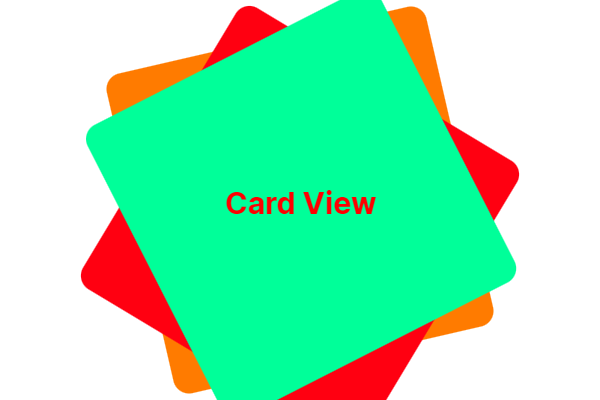
The CardSwipeOrTap composable manages the card stack. It uses a Box to overlay cards on top of each other and applies a slight rotation and vertical offset for a realistic stacked effect.
Each card is individually rendered using the CardItem composable. We use a simple CoroutineScope to delay actions and allow for smooth animations between swipe or tap events.
@Composable
fun CardSwipeOrTap(modifier: Modifier = Modifier) {
    val scope = rememberCoroutineScope()
    var cards by remember { mutableStateOf(listOf(0, 1, 2)) }
    var isAnimating by remember { mutableStateOf(false) }

    val cardColors = listOf(
        Color(0xFFFF9800), // Orange
        Color(0xFFF44336), // Red
        Color(0xFF00E676)  // Light Green
    )

    Box(
        modifier = modifier.fillMaxSize().padding(32.dp),
        contentAlignment = Alignment.Center
    ) {
        cards.reversed().forEachIndexed { index, cardIndex ->
            CardItem(
                index = cardIndex,
                color = cardColors[cardIndex % cardColors.size],
                rotation = if (index == 0) 0f else if (index == 1) -10f else 10f,
                offsetY = (index * 20).dp,
                isTop = index == cards.size - 1,
                isAnimating = isAnimating,
                onSwiped = {
                    if (!isAnimating) {
                        isAnimating = true
                        scope.launch {
                            kotlinx.coroutines.delay(300)
                            val updated = cards.toMutableList()
                            val removed = updated.removeAt(0)
                            updated.add(removed)
                            cards = updated
                            isAnimating = false
                        }
                    }
                }
            )
        }
    }
}
Animating Card Movement with CardItem
The CardItem composable handles the animation when a user swipes or taps a card. It uses animateDpAsState and animateFloatAsState to animate the card’s offset and opacity, giving the appearance of a disappearing card when an interaction occurs.
@Composable
fun CardItem(
    index: Int,
    color: Color,
    rotation: Float,
    offsetY: Dp,
    isTop: Boolean,
    isAnimating: Boolean,
    onSwiped: () -> Unit
) {
    val animatedOffsetX by animateDpAsState(
        targetValue = if (isAnimating && isTop) 500.dp else 0.dp,
        animationSpec = if (isAnimating && isTop) tween(durationMillis = 500, easing = FastOutLinearInEasing) else snap(),
        label = "OffsetXAnimation"
    )

    val animatedAlpha by animateFloatAsState(
        targetValue = if (isAnimating && isTop) 0f else 1f,
        animationSpec = if (isAnimating && isTop) tween(durationMillis = 3000) else snap(),
        label = "AlphaAnimation"
    )

    Card(
        modifier = Modifier
            .fillMaxWidth(0.7f)
            .aspectRatio(1f)
            .offset(x = animatedOffsetX, y = offsetY)
            .graphicsLayer {
                rotationZ = rotation
                alpha = animatedAlpha
            }
            .pointerInput(isTop) {
                if (isTop && !isAnimating) {
                    detectDragGestures(
                        onDragEnd = { onSwiped() },
                        onDrag = { change, _ -> change.consume() }
                    )
                }
            }
            .pointerInput(isTop) {
                if (isTop && !isAnimating) {
                    detectTapGestures(
                        onTap = { onSwiped() }
                    )
                }
            },
        elevation = CardDefaults.cardElevation(defaultElevation = 8.dp),
        shape = RoundedCornerShape(20.dp),
        colors = CardDefaults.cardColors(
            containerColor = color,
            contentColor = Color.White
        )
    ) {
        Box(
            modifier = Modifier.fillMaxSize(),
            contentAlignment = Alignment.Center
        ) {
            Text(
                text = "Card #$index",
                style = MaterialTheme.typography.titleLarge,
                color = Color.White
            )
        }
    }
}
Final Thoughts for Card Animation in Jetpack
With just a few lines of Kotlin code, you can create a stunning card swipe and tap animation in Jetpack Compose. This approach is not only visually appealing but also highly interactive, offering a smooth user experience without the complexity of a traditional RecyclerView setup. Try it out in your next Android app project!
You can also read the official Jetpack Compose animation documentation.