How to Use Jetpack Compose and Flutter to Make a Custom Loading Animation for Mobile App
Loading indicators are an important part of making a mobile experience look and feel smooth and professional. A lot of developers use built-in progress bars or spinners, but custom animations can make your app look different, help with branding, and make it feel like it’s flowing.
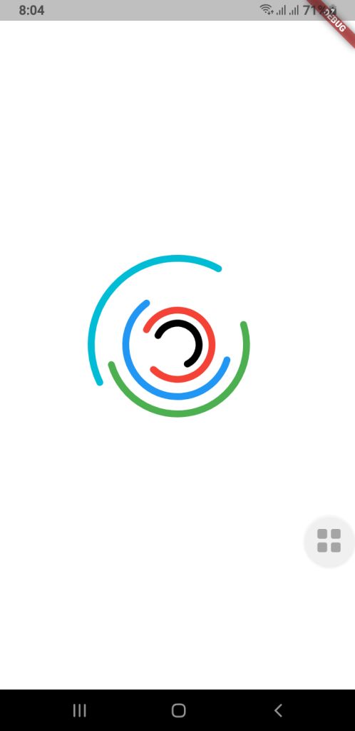
This guide will show you how to use Jetpack Compose (for Android) and Flutter to make a more complex custom loading animation for mobile apps. The goal is to make a fun-to-watch multi-ring spinner animation that spins in different directions, at different speeds, and with arcs of different shapes. Your UI will look fresh and new with this.
⭐ Why It’s Important to Have a Custom Loading Animation
A good loading animation will give you
- More interaction with users
- Different looks for each brand
- There are no issues when you switch screens.
- It feels like a premium app.
People believe they don’t have to wait as long.
You can make complicated animated parts with very little code using Jetpack Compose and Flutter, two modern UI frameworks.
Jetpack Compose for Android lets you make your own loading animation.
Developers can make UI in a declarative way with Jetpack Compose and use powerful APIs to add animations. We want to make a spinner with a lot of rings that are stacked on top of each other and spin by themselves.
1. Model for Setting Up a Ring
First, we discuss the features of each animated ring:
-
Radius
-
Color
-
Stroke width
-
Opacity
-
Arc length
-
Direction of rotation
-
Rotation speed
These properties allow full customization for each ring in the spinner.
RingConfig Model
data class RingConfig(
    val id: String,
    val radius: Float,
    val color: Color,
    val strokeWidth: Float,
    val opacity: Float,
    val arcLength: Float,
    val direction: Int,     // +1 or -1
    val speed: Float        // seconds per rotation
)
2. Creating the Custom Loading Animation
For smooth animations that never end, Compose has rememberInfiniteTransition.
Each ring has its own float animation that shows how it turns:
-
Independent rotation for each ring
-
Control over speed and direction
Ad loading... -
Smooth, continuous animation
3. Drawing on a Canvas
There are dashed arcs and a rotating effect on the rings drawn on Canvas.
This setup allows:
- Changeable radius
- Stroke width that can be changed
- Dividing arcs into parts
- Each layer can move by itself.
These pieces work together to make a loading animation that looks great and works well with Android apps that are up to date.
Spinner Composable Function
@Composable
fun Loading(
    rings: List,
    size: Dp = 400.dp
) {
    //  All animations must be created here, NOT inside Canvas
    val transition = rememberInfiniteTransition()

    // Pre-calc animations for each ring
    val rotations = rings.map { ring ->
        transition.animateFloat(
            initialValue = 0f,
            targetValue = ring.direction * 360f,
            animationSpec = infiniteRepeatable(
                animation = tween(
                    durationMillis = (ring.speed * 1000).toInt(),
                    easing = LinearEasing
                ),
                repeatMode = RepeatMode.Restart
            )
        )
    }

    Box(
        modifier = Modifier.size(size),
    ) {
        Canvas(modifier = Modifier.fillMaxSize()) {

            val center = Offset(this.size.width / 2, this.size.height / 2)

            rings.forEachIndexed { index, ring ->
                val rotation = rotations[index].value

                val circumference = 2f * PI.toFloat() * ring.radius
                val dashArray = circumference * ring.arcLength
                val dashGap = circumference - dashArray

                rotate(rotation, pivot = center) {
                    drawCircle(
                        color = ring.color.copy(alpha = ring.opacity),
                        radius = ring.radius,
                        center = center,
                        style = Stroke(
                            width = ring.strokeWidth,
                            cap = StrokeCap.Round,
                            pathEffect = PathEffect.dashPathEffect(
                                floatArrayOf(dashArray, dashGap),
                                phase = 0f
                            )
                        )
                    )
                }
            }
        }
    }
}
How to use this Loading Composable Function
MainActivity.kt
class MainActivity : ComponentActivity() {
    override fun onCreate(savedInstanceState: Bundle?) {
        super.onCreate(savedInstanceState)
        enableEdgeToEdge()
        setContent {
            LoaderTheme {
                CustomSpinLoading()
            }
        }
    }
}

@Composable
fun CustomSpinLoading() {
    val rings = listOf(
        RingConfig(
            id = "a",
            radius = 50f,
            color = Color.Black,
            strokeWidth = 14f,
            opacity = 1f,
            arcLength = 0.6f,
            direction = -1,
            speed = 6f
        ),
        RingConfig(
            id = "b",
            radius = 80f,
            color = Color.Red,
            strokeWidth = 14f,
            opacity = 1f,
            arcLength = 0.8f,
            direction = 1,
            speed = 8f
        ),
        RingConfig(
            id = "c",
            radius = 120f,
            color = Color.Blue,
            strokeWidth = 14f,
            opacity = 0.9f,
            arcLength = 0.6f,
            direction = -1,
            speed = 9f
        ),
        RingConfig(
            id = "d",
            radius = 160f,
            color = Color.Green,
            strokeWidth = 14f,
            opacity = 0.8f,
            arcLength = 0.5f,
            direction = 1,
            speed = 9f
        ),

        RingConfig(
            id = "e",
            radius = 200f,
            color = Color.Cyan,
            strokeWidth = 14f,
            opacity = 0.8f,
            arcLength = 0.4f,
            direction = -1,
            speed = 8f
        )
    )

    Loading(rings = rings, size = 400.dp)
}
🟩 Flutter Loading Animation That You Can Change
Flutter has its own animation system that is based on controllers and custom painters, but it works in a similar way to declarative programming.
Check out the code below:
RingConfig.dart Model Class
class RingConfig {
final String id;
final double radius;
final Color color;
final double strokeWidth;
final double opacity;
final double arcLength;
final int direction; // +1 or -1
final double speed; // seconds per rotation

RingConfig({
required this.id,
required this.radius,
required this.color,
required this.strokeWidth,
required this.opacity,
required this.arcLength,
required this.direction,
required this.speed,
});
}
Drawing with CustomPainter
import 'dart:math';
import 'package:flutter/cupertino.dart';
import 'RingConfig.dart';

class LoadingPainter extends CustomPainter {
final List<RingConfig> rings;
final List<Animation<double>> rotations;

LoadingPainter(this.rings, this.rotations);

@override
void paint(Canvas canvas, Size size) {
final center = Offset(size.width / 2, size.height / 2);

for (int i = 0; i < rings.length; i++) {
final ring = rings[i];
final rotation = rotations[i].value;

final paint = Paint()
..color = ring.color.withValues()
..style = PaintingStyle.stroke
..strokeWidth = ring.strokeWidth
..strokeCap = StrokeCap.round;

final circumference = 2 * pi * ring.radius;
final dashLength = circumference * ring.arcLength;
final dashGap = circumference - dashLength;

final circlePath = Path()
..addOval(Rect.fromCircle(center: center, radius: ring.radius));

final dashedPath = _dashPath(circlePath, dashLength, dashGap);

canvas.save();
canvas.translate(center.dx, center.dy);
canvas.rotate(rotation * pi / 180);
canvas.translate(-center.dx, -center.dy);

canvas.drawPath(dashedPath, paint);

canvas.restore();
}
}

@override
bool shouldRepaint(covariant CustomPainter oldDelegate) => true;
}

Path _dashPath(Path source, double dashLength, double dashGap) {
final Path dest = Path();
double distance = 0.0;

for (final metric in source.computeMetrics()) {
while (distance < metric.length) {
final next = distance + dashLength;
dest.addPath(metric.extractPath(distance, next), Offset.zero);
distance = next + dashGap;
}
distance = 0.0;
}
return dest;
}
Custom Loading Widget
import 'package:flutter/cupertino.dart';
import 'RingConfig.dart';
import 'LoadingPainter.dart';
import 'package:flutter/material.dart';


class Loading extends StatefulWidget {
  final List<RingConfig> rings;
  final double size;

  const Loading({super.key, required this.rings, this.size = 400});

  @override
  State<Loading> createState() => _LoadingState();
}

class _LoadingState extends State<Loading> with TickerProviderStateMixin {
  late List<AnimationController> controllers;
  late List<Animation<double>> rotations;

  @override
  void initState() {
    super.initState();

    controllers = widget.rings.map((ring) {
      return AnimationController(
        duration: Duration(milliseconds: (ring.speed * 1000).toInt()),
        vsync: this,
      )..repeat();
    }).toList();

    rotations = List.generate(
      widget.rings.length,
      (i) => Tween<double>(
        begin: 0,
        end: widget.rings[i].direction * 360,
      ).animate(controllers[i]),
    );
  }

  @override
  void dispose() {
    for (var controller in controllers) {
      controller.dispose();
    }
    super.dispose();
  }

  @override
  Widget build(BuildContext context) {
    return SizedBox(
      width: widget.size,
      height: widget.size,
      child: AnimatedBuilder(
        animation: Listenable.merge(controllers),
        builder: (_, __) {
          return CustomPaint(painter: LoadingPainter(widget.rings, rotations));
        },
      ),
    );
  }
}
How to use this Loading widget in Flutter?
main.dart
import 'package:flutter/material.dart';

import 'RingConfig.dart';
import 'Loading.dart';

void main() {
  runApp(const MyApp());
}

class MyApp extends StatelessWidget {
  const MyApp({super.key});

  // This widget is the root of your application.
  @override
  Widget build(BuildContext context) {
    return MaterialApp(
      title: 'Custom Loading',
      theme: ThemeData(
        colorScheme: ColorScheme.fromSeed(seedColor: Colors.deepPurple),
      ),
      home: const MyHomePage(title: 'Loading Animation'),
    );
  }
}

class MyHomePage extends StatefulWidget {
  const MyHomePage({super.key, required this.title});

  final String title;

  @override
  State<MyHomePage> createState() => _MyHomePageState();
}

class _MyHomePageState extends State<MyHomePage> {
  @override
  Widget build(BuildContext context) {
    final rings = [
      RingConfig(
        id: "a",
        radius: 25,
        color: Colors.black,
        strokeWidth: 8,
        opacity: 1,
        arcLength: 0.6,
        direction: -1,
        speed: 6,
      ),
      RingConfig(
        id: "b",
        radius: 40,
        color: Colors.red,
        strokeWidth: 8,
        opacity: 1,
        arcLength: 0.8,
        direction: 1,
        speed: 8,
      ),
      RingConfig(
        id: "c",
        radius: 60,
        color: Colors.blue,
        strokeWidth: 8,
        opacity: 0.9,
        arcLength: 0.6,
        direction: -1,
        speed: 9,
      ),
      RingConfig(
        id: "d",
        radius: 80,
        color: Colors.green,
        strokeWidth: 8,
        opacity: 0.8,
        arcLength: 0.5,
        direction: 1,
        speed: 9,
      ),
      RingConfig(
        id: "e",
        radius: 100,
        color: Colors.cyan,
        strokeWidth: 8,
        opacity: 0.8,
        arcLength: 0.4,
        direction: -1,
        speed: 8,
      ),
    ];

    return Scaffold(
      backgroundColor: Colors.white,
      body: Center(child: Loading(rings: rings, size: 400)),
    );
  }
}
Final Thoughts
You can make a loading animation just for mobile apps (Jetpack Compose and Flutter), and it can be very rewarding. Both frameworks give developers everything they need to make motion graphics that are expressive without having to use animated assets or libraries from other companies.
This multi-ring spinner is a great example of:
- Design of animations that can be changed
- Framework-level APIs for drawing
- Animation loops that go on forever and work well
- Consistency between platforms
A well-designed loader can make your user interface a lot better, whether you’re making apps just for Android or for more than one platform.